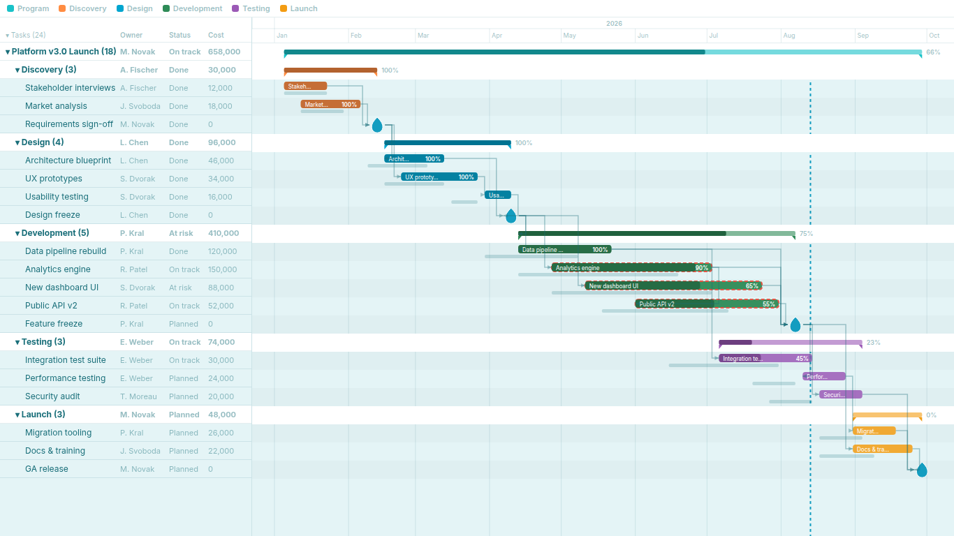
Critical path in Power BI without Microsoft Project
Every programme review has the same first question: if this task slips a week, does the end date move? The critical path answers it, and most Power BI project dashboards cannot show it. This article covers what the critical path is, why it resists DAX, what the usual approximations cost, and what changes when it is computed in the visual.
What the critical path is
A project plan with dependencies is a directed graph. Tasks are nodes; a finish-to-start dependency ("B cannot start until A finishes") is an edge from A to B. The critical path is the longest chain of such dependencies from the start of the project to its end, measured in duration. Every task on that chain has zero slack: delay it by a day and the project end moves by a day. Every task off the chain has some slack, the number of days it can slip before it joins the critical path.
The classical computation is two passes over the graph. The forward pass computes each task's earliest start (the latest early finish among its predecessors) and earliest finish (early start plus duration). The backward pass, from the project end, computes each task's latest finish (the earliest late start among its successors) and latest start. Slack is late start minus early start. Tasks with zero slack form the critical path. In a plan with parallel chains there can be more than one, and a near-critical chain with one day of slack is worth showing too.
The point that matters for Power BI: every task's early start depends on the early finish of every predecessor, which depends on their predecessors, and so on back to the beginning. The number of hops is not known in advance and varies from plan to plan.
Why it is impractical in DAX
DAX has no recursion. A measure cannot call itself and a calculated column cannot refer to its own value on another row. The PATH family of functions handles parent-child hierarchies, but those are trees: each node has exactly one parent. A dependency network is a directed acyclic graph in which a task can have three predecessors, and PATH cannot represent it.
You can unroll the recursion by hand. One calculated column computes early finish for tasks with no predecessors; a second computes it for tasks whose predecessors are all in the first set; a third for the next layer. Each column is a MAXX over the predecessor list, which first has to be split from its comma-separated form in Power Query. Five columns handle chains of five hops. A construction schedule with three hundred tasks routinely has chains of thirty or forty. Nobody maintains forty calculated columns, and the day the plan gains a longer chain, the last tasks silently get the wrong dates.
There is a further problem even if the unrolling were tolerable. Calculated columns are evaluated at refresh, over the whole table. Filter the report to one workstream and the columns still hold the numbers for the full plan. A what-if scenario driven by a slicer cannot recompute them at all.
Power Query and Python: correct, and stale
The realistic approximations move the computation out of DAX.
In Power Query, an M function can iterate: start with the tasks that have no predecessors, compute their early finish, then repeatedly compute the next layer with List.Generate or a recursive function until nothing changes. This is a fixed-point iteration over the graph and it is correct. It runs at refresh in the mashup engine, and on a few thousand tasks it is slow enough to notice but usable.
With Python or R, a script step in Power Query loads the tasks into a data frame, builds the graph in a library such as networkx, and asks for the longest path. It is about fifteen lines and it is also correct.
Both go stale in the same way. The result is a column in the table, computed when the dataset last refreshed. Between refreshes the plan in the source system changes and the critical path in the report does not. In the Power BI service, scheduled refresh is limited to a handful of runs per day on shared capacity, and the Python and R script steps need a personal gateway, which means a specific desktop machine has to be on. After the author leaves, the M function or the script is the part of the model nobody dares to touch.
They also answer the wrong question under a filter. The column holds the critical path of the whole plan. Filter to one phase and the highlighted tasks are whichever tasks of the global path happen to fall in that phase, not the path through the phase. For a steering committee looking at a single workstream that is confusing rather than helpful.
Computing it in the visual
The alternative is to leave the model alone and compute the path where the data is rendered. A Gantt visual receives the task rows that survive the page's filters, including a predecessor field with the comma-separated list of task names. It splits the list, builds the graph, runs the forward and backward passes and highlights the zero-slack chain, all in the browser, in milliseconds for a plan of a few hundred tasks.
This changes the workflow in three ways.
The path is always current. It is recomputed every time the visual receives data, which means after every refresh and after every slicer click. There is no column to go stale and no script to maintain.
The path responds to the filter. Filter to a workstream and the visual computes the critical path through the tasks it can see. Filter to the whole programme and it computes the programme path. The same chart answers both questions, and it is obvious which one it is answering because the tasks on screen are the ones in the graph.
The data model stays one table. Predecessors live in one text column, which is how they arrive from a spreadsheet or a scheduling-tool export. There is no bridge table with one row per link, no relationship to maintain, and no refresh dependency on a machine under someone's desk.
In a programme review, that means the chart on the wall can be filtered live to the workstream under discussion, the critical path through it appears, and the baseline ghost bars next to each task show which of those tasks has already slipped and by how much. The question "does this slip move the end date" gets answered while the person who asked it is still in the room, without anyone opening Microsoft Project.
SmartVisuals Gantt Chart
SmartVisuals Gantt Chart does exactly this. Map a comma-separated predecessor field to Dependencies and finish-to-start arrows are drawn between tasks; from those arrows the visual computes the longest chain through the network and highlights it as the critical path. Baseline Start and Baseline End add the ghost bars with the slip spelled out in the tooltip, and Parent Task builds the collapsible hierarchy that keeps a three-hundred-task plan readable. All of it runs locally inside Power BI with no external service. Dependencies, critical path and baselines are premium features; they are fully unlocked in edit mode so the chart can be built and checked before buying, and viewers without a licence still see the full timeline, hierarchy and milestones.
Try AI Chatbot for Free
Experience the power of conversational analytics in your Power BI reports. Get your free license in seconds - no credit card required.
Get Free License