
Visuals/Pl. I

    Gantt Chart

    Project timelines that show what actually drives your schedule

    A collapsible work-breakdown hierarchy, dependency arrows, automatic critical path and plan-vs-actual baselines — all computed locally inside Power BI.

    Datasheet
    Status
    Available on Microsoft AppSource
    Price
    $2.99 /user/mo · $29 /user/yr
    Licensing
    Per user, assigned in the Microsoft 365 admin center. Unlicensed viewers see the free tier, never a blocked visual.
    Data
    Computed inside Power BI. No external calls, no API keys, no telemetry.
    Visuals API
    5.11
    Accessibility
    Keyboard navigation, cross-highlight, high-contrast mode
    Works in
    Power BI Desktop, Service, Embedded
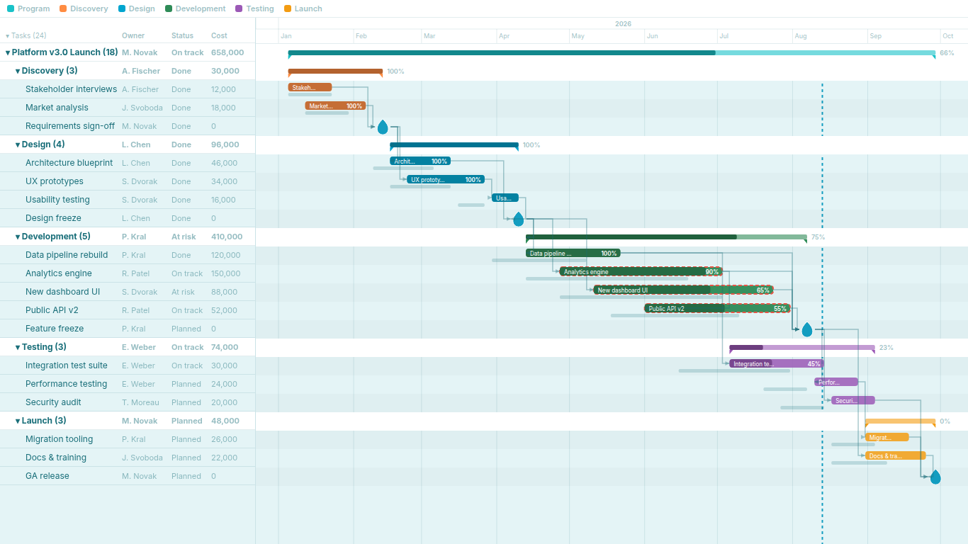
    Power BI Gantt chart with work-breakdown hierarchy, dependency arrows and critical path
    Pl. I  ·  Gantt Chart  ·  Work-breakdown hierarchy with rollup bars, data grid, dependency arrows and critical path.rendered from the shipped visual
    What it does

    SmartVisuals Gantt Chart turns Power BI into a real project-tracking tool. Build a schedule with a collapsible work-breakdown hierarchy, watch progress roll up to summary bars, and trace what actually drives your timeline through dependency arrows, critical-path highlighting and plan-vs-actual baselines.

    It works well for construction schedules, product roadmaps, campaign calendars, implementation plans, portfolio timelines and sprint overviews. Everything is computed locally inside Power BI — no external services, no API keys, no data leaving your report.

    Free and premium

    Where the line is, exactly.

    Report authors see the full premium set in edit mode, so you can evaluate every feature on your own data before assigning a single licence. Unlicensed viewers always get a working chart.

    Free tierevery viewer
    • Parent-child task hierarchyRollup summary bars with expand/collapse, including one-click collapse all — finished phases fold into an executive summary.
    • Calendar-aligned two-level time axisDay, week and month zoom with sticky headers that stay in place as you scroll, plus weekend shading and a today line.
    • Milestones and progressDiamonds, circles, stars or flags, progress bars with 0–1 / 0–100 auto-detection, and overdue highlighting.
    • Category colors and cross-filteringInteractive legend, tooltips, and full cross-filtering with the rest of your report — click a bar or legend chip to filter.
    • Four built-in themesIncluding the turquoise SmartVisuals look with water-drop milestones, report-theme colors and a custom or transparent background. Everything cosmetic is free.
    Premium$2.99 /user/mo · first month free
    • Dependency arrowsFinish-to-start connectors drawn from a simple comma-separated predecessor field. No separate relationship table to model.
    • Critical pathThe longest chain through your dependency network, highlighted automatically — see which slip actually moves the end date.
    • Baseline comparisonGhost bars showing the original plan, with the slip spelled out in the tooltip ("+3 days late").
    • Grid columnsUp to three sortable data columns beside the task names for Owner, Status, Cost or anything else in your model.

    Gantt chart in Power BI: what the built-in options leave out

    Power BI has no native Gantt chart. The usual workarounds are a stacked bar chart with an invisible offset series, a matrix with conditional formatting, or one of the free Gantt visuals on the marketplace. All of them draw bars, and all of them stop at the bar: no dependency arrows, no critical path, no baseline against the original plan, and a flat task list with no hierarchy to collapse.

    SmartVisuals Gantt Chart starts where those stop. Task, Start Date and End Date give you a working chart in one drag. Parent Task turns it into a work-breakdown structure with roll-up summary bars. Dependencies, Baseline Start and Baseline End add the project-management layer, and every calculation, including the critical path, runs inside the visual in your browser.


    Dependencies and critical path without a project-management tool

    Map one comma-separated predecessor field to Dependencies and finish-to-start arrows are drawn between tasks. There is no relationship table to model and no bridge table to maintain; the field can come straight from your planning export.

    From the arrows the visual computes the critical path: the longest chain through the dependency network, highlighted so you can see which slip actually moves the end date and which slip has slack. On a programme review that is the question people ask first, and the chart answers it without anyone opening Microsoft Project.

    Plan versus actual: baselines that show slip

    Add Baseline Start and Baseline End and every bar gets a ghost bar underneath showing the original plan. The tooltip spells out the difference in days, so a task three days late reads as three days late rather than as two bars of slightly different length.

    Because baselines live in the model, they can come from a snapshot table, a versioned plan or a simple copy of last quarter's dates. Progress can be stored as a fraction from 0 to 1 or as a percentage from 0 to 100; the visual detects which and a Progress Format setting overrides it when your data is ambiguous.

    A work-breakdown structure that folds into an executive summary

    Parent Task builds the hierarchy. Summary bars roll up their children, with progress weighted by duration, and each phase expands or collapses on click. One Collapse All folds a two-hundred-task plan into six phase bars, which is the view most steering committees want, while the detail stays one click away.

    Up to three grid columns sit beside the task names for Owner, Status, Cost or anything else in your model, sortable and summed on summary rows. The time axis zooms from months to weeks to days with a sticky header, weekend shading and a today line, and the whole chart cross-filters the rest of the report from any bar or legend chip.

    What the visual expects from your data

    Three fields are required: a task name, a start date and an end date. Parent Task and Dependencies reference other tasks by name, so task names should be unique within a plan. A task whose start and end date are the same renders as a milestone marker. Rows with dates that cannot be parsed are skipped and reported through the standard Power BI warning icon, so a broken date never silently deletes a task.

    It works well for construction schedules, product roadmaps, campaign calendars, implementation plans, portfolio timelines and sprint overviews: any plan with a few dozen to a few hundred tasks that people need to read, not just look at.

    Getting started

    From empty canvas to first chart.

    1. 01

      Drop in Task, Start Date and End Date and you have a working chart.

    2. 02

      Add Parent Task for hierarchy and Dependencies for arrows.

    3. 03

      Add Progress %, Baseline Start/End, Category, Grid Columns or extra Tooltips fields as your project needs them.

    4. 04

      Tip: give a task the same start and end date and it renders as a milestone marker.

    Get Gantt Chart

    Two ways in.

    Installation instructions for both paths are on the download page.

    Microsoft AppSource (recommended)

    Reviewed by Microsoft, updates automatically, licences assigned in the Microsoft 365 admin center.

    Open AppSource

    Direct download (1.0.1.0)

    .pbiviz package, import into Power BI Desktop or Service, does not auto-update. Includes the full free tier; premium features preview in edit mode and are licensed through AppSource.

    Download .pbiviz
    Questions

    Asked before you did.

    More questions? See support or write to hello@smartvisuals.io.

    Missing something?

    Tell us what is missing.

    A feature you need, a bug you hit, a visual that does not exist yet. Every message reaches the person who builds these visuals, and feature requests shape what ships next. We also build visuals to order.

    Also in the family