Notes from the workshop.
How we build Power BI visuals, what we learn from the marketplace, and how to get more out of the ones you already use.
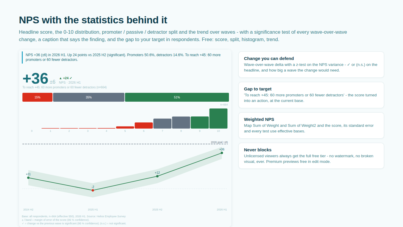
Your NPS went up by 3. Is that real?
The margin of error on a Net Promoter Score, why its variance is not what a proportion calculator says, how to test a wave-over-wave change, and what to do with the answer in Power BI.
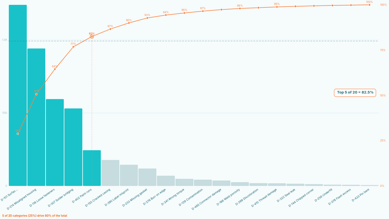
The Pareto chart DAX recipe for Power BI, and the three ways it breaks
The RANKX cumulative-percentage pattern, why it fails on ties, slicers and sort order, and what a correct Pareto needs beyond the line.
D7, D30 and rolling retention: three definitions that give three numbers
Classic, rolling and sequential retention computed on the same ten users, the denominator each pairs with, and why a chart must name its definition.
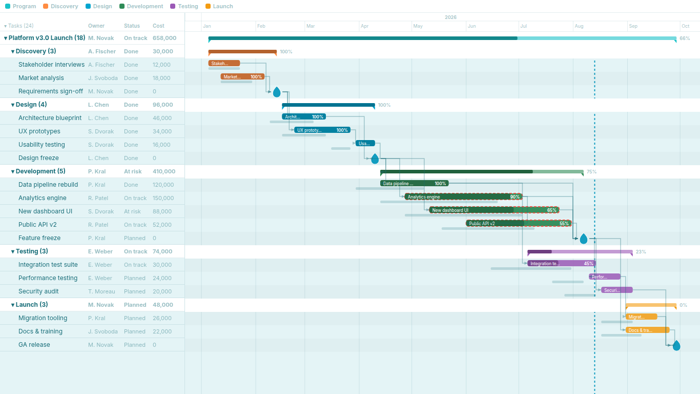
Critical path in Power BI without Microsoft Project
What the critical path is, why DAX cannot compute it, why Power Query and Python versions go stale, and what changes when the visual computes it.
Gantt chart in Power BI: native workarounds versus custom visuals
The stacked-bar trick, the matrix heat-grid and the free Gantt visuals, what each can and cannot do, and what a project-management Gantt needs.
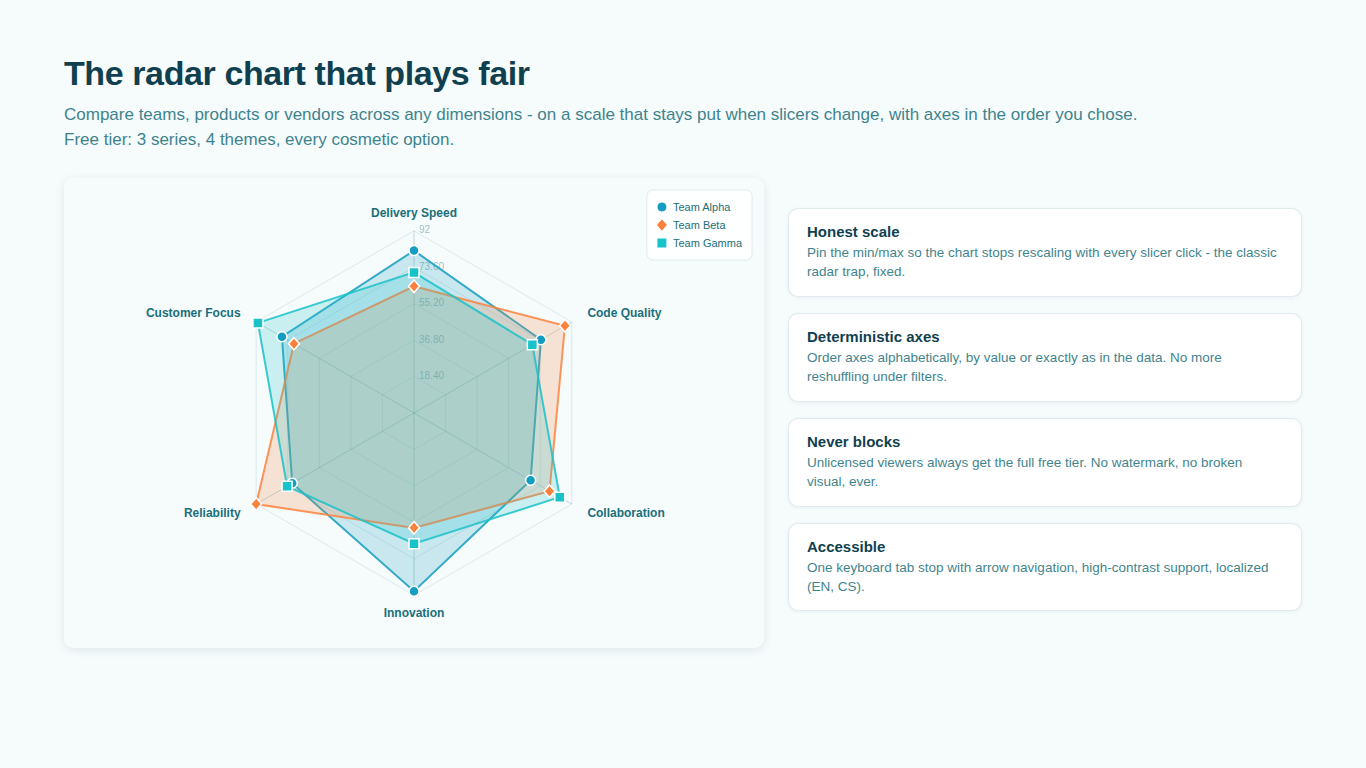
Why your Power BI radar chart changes shape every time you click
Autoscaling under slicers, pinned axis bounds, stable axis order, normalization for mixed units, and when a radar is the wrong chart.
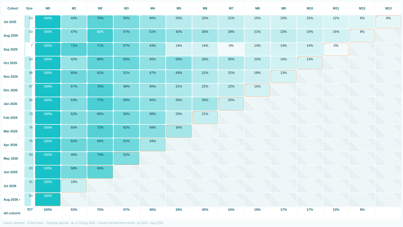
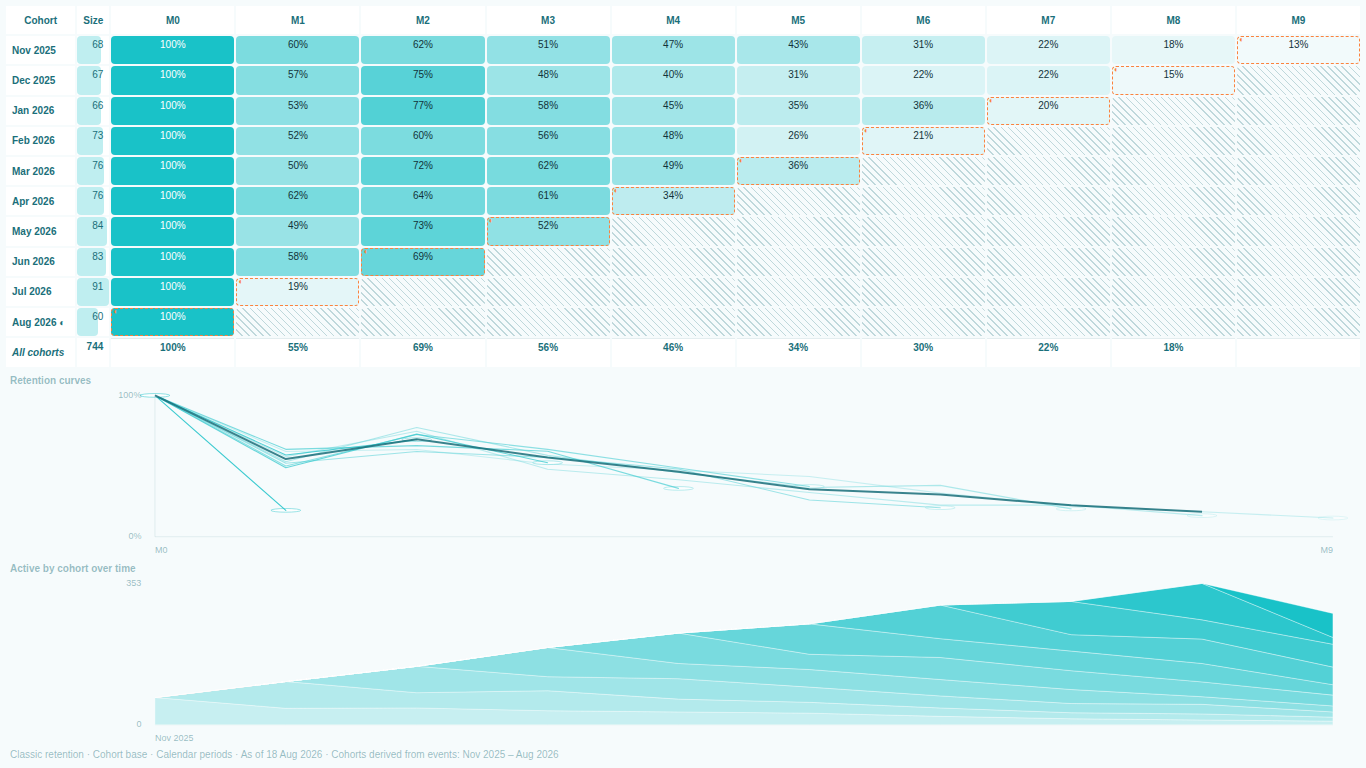
Cohort retention in Power BI: the DAX recipe, and where it breaks
The five-part DAX recipe for a retention triangle written out in full, and the three places it quietly produces wrong numbers.
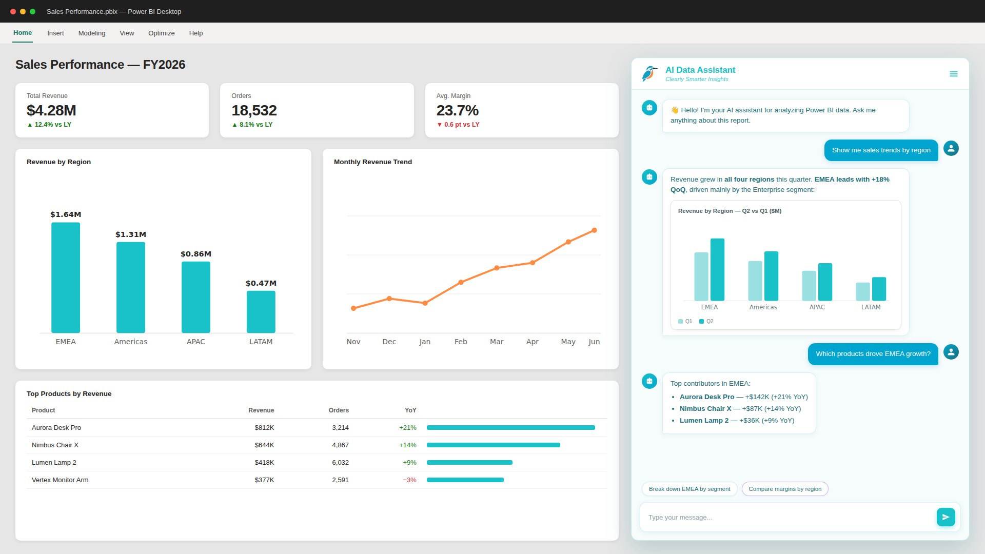
From question to chart: Conversational analytics in Power BI
Ask in plain English and get a chart in seconds - inside Power BI.