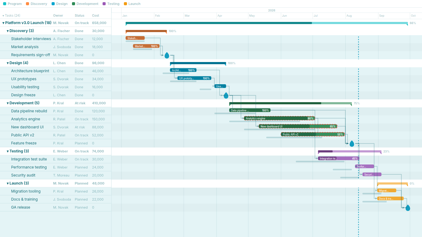
Gantt chart in Power BI: native workarounds versus custom visuals
Power BI has no native Gantt chart. That has been true since 2015 and it is still true, so every report that needs a timeline uses one of three workarounds: a stacked bar chart with an invisible first segment, a matrix with conditional formatting, or a free Gantt visual from the marketplace. Each is fine for what it is. The problem is that "Gantt chart" means two different things, and the workarounds only deliver one of them.
The model for the examples: a Tasks table with Task, Start, End, and optionally Parent, Progress and Predecessors.
Workaround 1: the stacked bar with an invisible offset
A horizontal stacked bar with two segments per task. The first segment runs from the project start to the task start and is coloured to match the background; the second segment is the task duration. Two measures:
Offset Days =
VAR ProjectStart =
    CALCULATE ( MIN ( Tasks[Start] ), REMOVEFILTERS ( Tasks ) )
RETURN
    DATEDIFF ( ProjectStart, MIN ( Tasks[Start] ), DAY )

Duration Days =
DATEDIFF ( MIN ( Tasks[Start] ), MAX ( Tasks[End] ), DAY ) + 1
Put Tasks[Task] on the Y axis, both measures in the values well in that order, set the fill of Offset Days to the page background (or fully transparent where the colour picker allows it), turn off its data labels and hide it from the legend. Sort the Y axis by Start.
What you get: bars in the right places, category colours if you split the duration by a legend field, cross-filtering with the rest of the report, and no custom visual to get approved.
What you do not get: the X axis shows day numbers from the project start, not dates, so the reader has to count. There is no today line unless you add a constant line at DATEDIFF ( ProjectStart, TODAY (), DAY ) and keep it current. Milestones need a bar of length one or a separate overlay. Progress needs a third segment and careful arithmetic. The list is flat: the Y axis can nest two fields, but there are no summary bars, no expand and collapse, and no roll-up. Dependencies, critical path and baselines are not possible in this form at all.
Workaround 2: the matrix with conditional formatting
Rows are tasks (or a Parent then Task hierarchy), columns are weeks from a disconnected calendar table, and a measure returns 1 where the task overlaps the week:
Is Active =
VAR PeriodStart = MIN ( 'Calendar'[Date] )
VAR PeriodEnd = MAX ( 'Calendar'[Date] )
VAR TaskStart = MIN ( Tasks[Start] )
VAR TaskEnd = MAX ( Tasks[End] )
RETURN
    IF ( TaskStart <= PeriodEnd && TaskEnd >= PeriodStart, 1 )
Conditional formatting colours the cell background by the measure, the font colour is set to match so the 1 disappears, and you have a heat-grid that reads as a Gantt.
This version has real advantages over the stacked bar. The columns are dates. The matrix supports a hierarchy with expand and collapse. Extra measures fit as additional columns beside the task name, which is the grid a project manager expects. Sticky headers come for free.
Its limits are the cell grid. A task that starts on Wednesday and ends the following Tuesday fills two week cells completely; precision is one column. A year in days is 365 columns, and a matrix with conditional formatting on that many cells is slow. Progress can be a second tint (return 2 for completed weeks), but there are no milestone shapes, no bar labels and no arrows. Roll-ups on the hierarchy rows only work if you write the roll-up logic into the measure. Baselines need a second grid, or a third tint that nobody can read.
Workaround 3: the free Gantt visuals
The free Gantt visuals on the marketplace, including Microsoft's own open-source one, draw a real timeline: a date axis, bars with progress fills, milestones, a today line, category colours and usually one level of grouping through a parent field. For a schedule of a few dozen tasks that people need to look at rather than analyse, this is enough, and it is the right choice.
What they share is a flat data model. Task, start, end, progress, category, maybe a parent for grouping. There is no predecessor field, so there are no dependency arrows and no critical path. There is no baseline field, so plan versus actual is not a concept. Grouping is a header row, not a summary bar with duration-weighted progress. Sorting, zoom and the time axis vary by visual, and several have not been updated in years.
What each option can and cannot do
| Capability | Stacked bar | Matrix grid | Free Gantt visuals | Project-management Gantt |
|---|---|---|---|---|
| Date axis | Day numbers | Weeks or days as columns | Yes | Yes, with zoom |
| Milestones | Workaround | No | Yes | Yes |
| Progress | Third segment | Second tint | Yes | Yes, rolled up |
| Hierarchy with summary bars | No | Rows only | Grouping header | Yes, collapsible |
| Grid columns beside tasks | No | Yes | Rarely | Yes, sortable |
| Dependency arrows | No | No | No | Yes |
| Critical path | No | No | No | Yes |
| Baselines with slip | No | No | No | Yes |
| Custom visual required | No | No | Yes | Yes |
The first three columns cover "a chart that shows when things happen". The fourth is "a chart that explains why the end date is where it is". Those are the two meanings of Gantt chart, and only the second one holds up in a programme review.
What a project-management Gantt needs
Five capabilities, and they build on each other.
Hierarchy with roll-ups. Tasks belong to phases, phases to workstreams. A summary bar spans its children from the earliest start to the latest end, and its progress is the duration-weighted average of theirs, so a phase with one long unfinished task does not read as 80 percent done because four short ones are complete. Collapsing the hierarchy is what turns a two-hundred-row plan into a one-page executive view without maintaining a second dataset.
Dependency arrows from a predecessor field. Planning exports, whether from spreadsheets or scheduling tools, carry predecessors as a comma-separated list of task names or IDs in one column. A visual that reads that column directly, rather than requiring a separate relationship table with one row per link, keeps the data model at one table and lets the arrows update when the export does.
Critical path. Given the arrows, the longest finish-to-start chain from the first task to the last is the critical path; every task on it has zero slack. Highlighting it answers the first question in any programme review: which slip moves the end date. It is a graph calculation over an arbitrary number of hops, which is why it does not belong in DAX and has to be computed in the visual; a separate article covers this in detail.
Baselines with slip in tooltips. A ghost bar under each task showing the original plan, with the difference spelled out as "+3 days late" in the tooltip rather than left for the reader to measure by eye. Because the baseline is two more date columns, it can come from a snapshot table, a versioned plan or last quarter's copy.
Grid columns. Owner, status, cost and the rest sit beside the task name, sortable, with numeric columns summed on summary rows. This is the part the matrix does well and the bar-chart workaround cannot do at all.
Where SmartVisuals Gantt Chart fits
SmartVisuals Gantt Chart is built for the fourth column of the table. The free tier covers the timeline and the structure: Task, Start Date and End Date give a working chart, Parent Task turns it into a collapsible hierarchy with roll-up summary bars, and the time axis zooms between day, week and month with a sticky header, weekend shading, a today line, milestone shapes and progress bars that detect whether your model stores 0 to 1 or 0 to 100.
Premium adds the four capabilities that none of the workarounds reach: dependency arrows from a comma-separated predecessor field, critical path highlighting, baseline ghost bars with the slip in the tooltip, and up to three sortable grid columns. Everything is computed inside the visual in the browser, with no external service. Premium features are unlocked while editing, so a report can be built and tested in full before anyone decides on a licence, and unlicensed viewers see the free tier rather than a blocked visual.
Try AI Chatbot for Free
Experience the power of conversational analytics in your Power BI reports. Get your free license in seconds - no credit card required.
Get Free License