The Pareto chart DAX recipe for Power BI, and the three ways it breaks
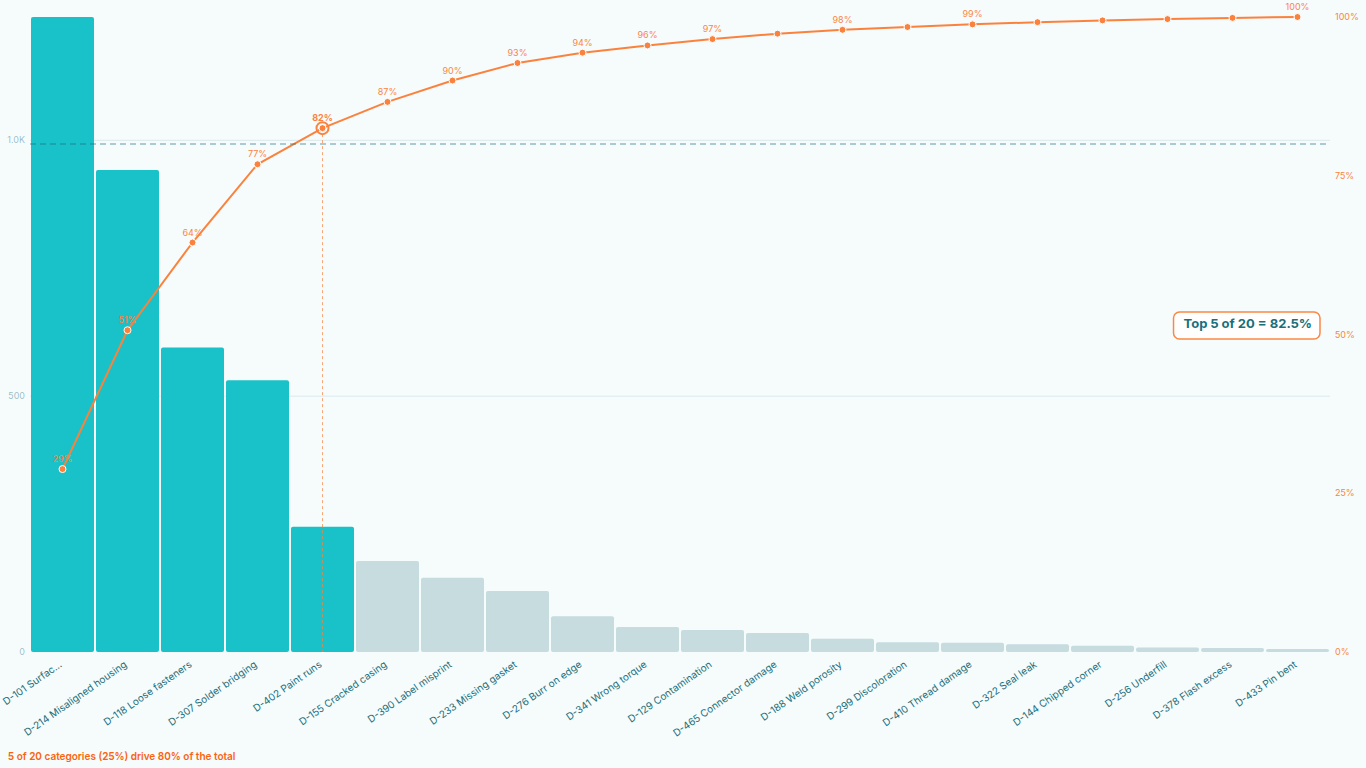
A Pareto chart is a bar chart sorted from largest to smallest with a line on top showing the running share of the total. Its job is to answer one question: which few categories explain most of the total. Power BI has no native Pareto chart, so most people build one from a combo chart and a cumulative-percentage measure. The recipe is short, it is on every forum, and it breaks in three specific ways that are worth understanding before you trust the chart in a review.
The recipe
Start with a table of categories and a value, say defect codes and counts. The cumulative percentage for a category is the sum of the values of every category with a rank at or above its own, divided by the grand total. In DAX that is usually written in two measures.
Rank by Value =
RANKX ( ALLSELECTED ( Defects[Code] ), [Total Count], , DESC, Dense )

Cumulative % =
VAR CurrentRank = [Rank by Value]
VAR Running =
    SUMX (
        FILTER (
            ALLSELECTED ( Defects[Code] ),
            [Rank by Value] <= CurrentRank
        ),
        [Total Count]
    )
RETURN
    DIVIDE ( Running, CALCULATE ( [Total Count], ALLSELECTED ( Defects[Code] ) ) )
Put the count on a column chart, the cumulative percentage on the line, sort the axis by the count descending, and you have a Pareto chart. On the first dataset it looks right. Then one of the following happens.
Break one: ties
Two defect codes with the same count get the same rank with Dense, so the cumulative measure adds both of them at that rank and the line jumps by two categories at once. Switch to Skip and the rank skips a number instead, so the running sum at the tied rank includes both tied categories and the line still jumps. Either way the line is no longer a staircase with one step per bar.
The fix people reach for is a tiebreaker in the ranking, usually the category name, which means writing the rank over a combined expression or adding a helper column with a unique sort key. It works, and now the measure has a hidden dependency on that helper column that nobody documents. Real data ties constantly: counts of small integers, cost rounded to whole currency units, anything bucketed.
Break two: slicers and filter context
The measure ranks over ALLSELECTED, so that a slicer on the plant re-ranks within the plant. That is correct until a visual-level filter or a cross-highlight from another chart changes what "selected" means. Highlight a bar in a neighbouring chart and the Pareto's categories are filtered but the rank is computed over the unhighlighted set, so the line no longer ends at 100 percent. Or the ranking honours the highlight but the grand total does not, and the line ends at 140 percent.
Every variant of the recipe makes a choice about which filters the rank respects and which the total respects, and the chart only works while those two choices agree. A report author who adds one more filter six months later has no way to know they just broke it.
Break three: sort order
A Pareto chart must be sorted by the value, descending. The combo chart sorts by whatever field the author picked in the sort menu, and that choice is a property of the visual, not of the measure. Sort by the category name, or by a different measure, and the bars are in the wrong order while the line still assumes the right order, because the rank was computed by value. The line then goes up and down across the chart, which is nonsense, and the chart still renders without a warning.
Sort order also differs between Power BI Desktop and the Service in edge cases, especially when values tie and the tiebreaker is the query's row order. A chart that looks fine on the author's machine can shuffle two adjacent bars for a viewer.
What a Pareto chart needs beyond the line
Suppose all three problems are solved with helper columns and discipline. The chart is still only a chart. The analysis a quality engineer or an inventory planner wants has a few more pieces.
The threshold. The 80 percent line is a decision, not a decoration. The categories to its left are the vital few and should be coloured as such; the count of them is the headline, "7 of 212 categories drive 80 percent of defects". Doing this in DAX needs a third measure that compares the cumulative percentage with the threshold and a conditional-formatting rule on the bars, and the count of vital-few categories needs a fourth measure for a card.
The long tail. A real SKU or defect-code Pareto has hundreds of categories. A combo chart with 400 bars is a scroll bar. Grouping the tail into an Others bar needs a calculated table or a disconnected parameter, and then the cumulative line has to know that Others is one bar made of many categories.
ABC classes. Inventory analysis splits the ranked list at 80, 95 and 100 percent into A, B and C classes. That is the SQLBI ABC pattern, a calculated column that has to be recomputed if the classification is meant to respond to slicers, which a calculated column cannot do.
Comparison. The question after every defect Pareto is whether the corrective action worked, which means two Paretos side by side, before and after, with the rank change per category. Two combo charts with a shared category axis and separate ranking contexts, with rank-change arrows drawn by a third visual, is possible and nobody does it twice.
Doing it in the visual instead
This is the point of a dedicated Pareto visual, and the reason we built SmartVisuals Pareto Chart. The visual receives the categories and the value, ranks them itself with a deterministic tiebreaker, and draws the bars and the line from that single ranking. There is no separate sort setting to get wrong, no filter-context choice to keep in sync, and ties produce one step per bar every time.
The threshold, the vital-few colouring and the insight sentence are computed from the same ranking, so a slicer on the plant re-ranks the plant's defects and rewrites the sentence. Up to 30,000 categories load in full, with a Top N and an Others bar that expands on click. ABC zones, the Minitab-style data table, before/after comparison with rank-change markers and small multiples per plant are the premium layer, and all of it previews free in edit mode.
If you would rather keep the DAX, the checklist is: a unique tiebreaker in the rank, one filter-context rule shared by rank and total, an axis sort locked to the value, and a note in the report telling the next author not to touch any of it. That is a fair amount of maintenance for a chart whose whole point is to make one thing obvious.
Try AI Chatbot for Free
Experience the power of conversational analytics in your Power BI reports. Get your free license in seconds - no credit card required.
Get Free License