Visuals/Pl. V

    Pareto Chart

    Pareto analysis, not just a Pareto chart

    Drop in a category and a measure and get a correct Pareto instantly: bars ranked by contribution, cumulative line, vital-few detection and an insight sentence, all computed in the visual. No DAX patterns to maintain.

    Datasheet
    Status
    Available on Microsoft AppSource
    Price
    $1.99 /user/mo · $19 /user/yr
    Licensing
    Per user, assigned in the Microsoft 365 admin center. Unlicensed viewers see the free tier, never a blocked visual.
    Data
    Computed inside Power BI. No external calls, no API keys, no telemetry.
    Visuals API
    5.11
    Accessibility
    Keyboard navigation, high-contrast mode
    Languages
    English, Czech, German, French, Spanish
    Works in
    Power BI Desktop, Service, Embedded
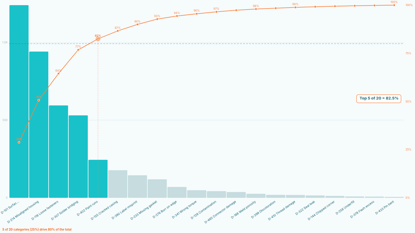
    Pareto chart in Power BI with vital-few bars, cumulative line, 80 % threshold and insight sentence
    Pl. V  ·  Pareto Chart  ·  Classic 80/20: vital-few bars, cumulative line, threshold and the insight sentence, with zero setup.rendered from the shipped visual
    What it does

    SmartVisuals Pareto Chart replaces the combo-chart-plus-DAX workaround with a visual that does the analysis itself. It ranks categories by contribution, draws the cumulative percentage line, marks the threshold, colours the vital few and writes the finding as a sentence: "7 of 212 categories drive 80 % of the total". Ties are handled deterministically, the sort is stable in Desktop and in the Service, and duplicate categories are aggregated before ranking.

    For quality and inventory teams it adds what the DIY route cannot: ABC classification with custom cut-offs, a Minitab-style data table, before/after comparison with rank-change markers, small multiples per plant or region, metric switching between count and cost, and up to 30,000 categories loaded in full with a configurable Others bar. Everything is computed inside Power BI; the visual makes no external calls.

    Free and premium

    Where the line is, exactly.

    Report authors see the full premium set in edit mode, so you can evaluate every feature on your own data before assigning a single licence. Unlicensed viewers always get a working chart.

    Free tierevery viewer
    • Correct by defaultDeterministic ordering with tied values, stable sort in Power BI Desktop and the Service, automatic aggregation of duplicate categories, and currency or percentage measures shown through your model's own format strings.
    • Cumulative line and thresholdAutomatic cumulative % line with a threshold line at any percentage (80/20 by default), plus bar values and cumulative % labels.
    • Vital few, trivial manyBars coloured by which side of the threshold they fall on, per-category colours and rules, and the insight sentence that names how many categories carry the total.
    • Top N with OthersShow the top N categories and group the rest into an Others bar instead of a scroll bar. Up to 25 individual categories render in the free tier.
    • Five themes and every cosmetic optionFive built-in themes, report theme colours, transparent background, and a format pane labelled with your real field names.
    • Native Power BI behaviourCross-filtering, drill hierarchies, bookmarks, tooltips, high contrast, keyboard navigation and five languages (EN, CS, DE, FR, ES).
    Premium$1.99 /user/mo · first month free
    • Unlimited categoriesRank and render every category in the data, up to 30,000, with the Others bar still available for the long tail.
    • ABC classificationA/B/C zones with custom cut-offs (80/95/100), zone shading, zone labels and the class of every category in its tooltip.
    • Smart Insights+A headline callout ("Top 7 of 212 = 80.3 %") and an annotated intersection where the cumulative line crosses the threshold.
    • QM modeA Minitab-style data table beside the chart with rank, value, percentage and cumulative percentage per category.
    • Before/after comparisonTwo periods side by side with rank-change markers, built for quality reviews of a corrective action.
    • Small multiplesOne Pareto per plant, line or region on a shared scale, from a single group field.
    • Metric switching and a second lineSwitch the ranking between measures (count vs. cost) from a dropdown, or draw a second cumulative line for the other metric.

    Pareto chart in Power BI: why the DAX workaround keeps breaking

    Power BI has no native Pareto chart. The usual recipe is a combo chart with a cumulative-percentage measure: rank the categories with RANKX, sum every value at or above the current rank, divide by the grand total. It works on the first dataset and then it breaks in one of three ways. Two categories tie and the ranking skips a number, so the cumulative line jumps. A slicer changes the ranking context and the line no longer adds to 100. Or somebody sorts the axis by a different field and the bars are no longer descending, which is the one thing a Pareto chart must be.

    SmartVisuals Pareto Chart does the whole calculation inside the visual. Map a category and a measure and the bars are ranked by contribution, the cumulative line is drawn, the threshold is marked and the vital few are coloured, in every filter state, with no measure to maintain. Ties are broken deterministically, the sort is stable in Power BI Desktop and in the Service, and duplicate category rows are aggregated before ranking.


    The 80/20 line, and where the vital few actually end

    The threshold line defaults to 80 percent and can sit at any percentage. Every category to the left of the point where the cumulative line crosses it is a vital-few category and gets the vital-few colour; everything to the right is the trivial many. The visual writes the finding as a sentence, "7 of 212 categories drive 80 % of the total", so the reader does not have to count bars.

    Because the split is computed, not eyeballed, it survives filters. Filter to one plant and the sentence updates to that plant's own vital few. That is the difference between a Pareto chart and a Pareto analysis: the chart shows the shape, the analysis names the categories that matter right now.

    ABC classification and the Minitab-style table

    Inventory and quality teams rarely stop at one threshold. ABC classification splits the ranked categories into an A zone, a B zone and a C zone at cut-offs you choose, 80 / 95 / 100 by default, shades the zones, labels them and carries the class into every tooltip. It is the SQLBI and DAX Patterns ABC recipe, without the calculated columns.

    QM mode adds the data table quality engineers expect beside the chart: rank, value, percentage and cumulative percentage per category, in the layout Minitab and Excel Pareto templates use, so a chart pasted into an audit report carries its own numbers.

    Before and after: did the corrective action work?

    Map a period field with two values to Compare and the visual draws the two Paretos side by side with rank-change markers, so the reader sees that the defect code that led before the corrective action has dropped to fourth. Map a plant, line or region instead and the same field turns into small multiples, one Pareto per group on a shared scale.

    Add a second measure to switch the ranking between count and cost from a dropdown, or draw a second cumulative line for the other metric, which answers the question that follows every defect Pareto: the most frequent defect is rarely the most expensive one.

    High-cardinality data without scroll bars

    Real SKU, customer and defect-code Paretos have hundreds or thousands of categories. The visual loads up to 30,000 of them, ranks them all, and shows the top N with the rest grouped into a single Others bar you can size, colour and expand on click. The free tier renders up to 25 individual categories plus Others, which covers teaching examples and small defect lists; unlimited categories are part of the premium licence.

    Values honour the format strings of your measures, so a currency measure shows as currency and a percentage measure as a percentage, and drill hierarchies work the way they do in native visuals.

    What the visual expects from your data

    One category column and one numeric measure are enough. The category can be a hierarchy for drill-down. Optional fields are Compare / Small multiples for a period or group, and Tooltips for extra measures. Nothing needs to be pre-sorted or pre-ranked; the visual ranks from the values it receives.

    It is built for defect and root-cause Paretos in quality management (ISO 9001, Six Sigma, SPC), revenue and SKU concentration in sales and inventory, downtime causes in maintenance, ticket categories in support, and any question of the form "which few of these explain most of that".

    Getting started

    From empty canvas to first chart.

    1. 01

      Map a category to Category and a measure to Value. The Pareto is ranked, the cumulative line drawn and the vital few coloured.

    2. 02

      Set the threshold percentage and the Top N in the format pane; the rest groups into Others.

    3. 03

      Add a period or group field to Compare / Small multiples: two values give a before/after comparison, more give one Pareto per group.

    4. 04

      Add a second measure to switch metrics or draw a second cumulative line, and extra measures to Tooltips.

    Get Pareto Chart

    Two ways in.

    Installation instructions for both paths are on the download page.

    Microsoft AppSource (recommended)

    Reviewed by Microsoft, updates automatically, licences assigned in the Microsoft 365 admin center.

    Open AppSource

    Direct download (1.1.1.0)

    .pbiviz package, import into Power BI Desktop or Service, does not auto-update. Includes the full free tier; premium features preview in edit mode and are licensed through AppSource.

    Download .pbiviz
    Questions

    Asked before you did.

    More questions? See support or write to hello@smartvisuals.io.

    Missing something?

    Tell us what is missing.

    A feature you need, a bug you hit, a visual that does not exist yet. Every message reaches the person who builds these visuals, and feature requests shape what ships next. We also build visuals to order.

    Also in the family