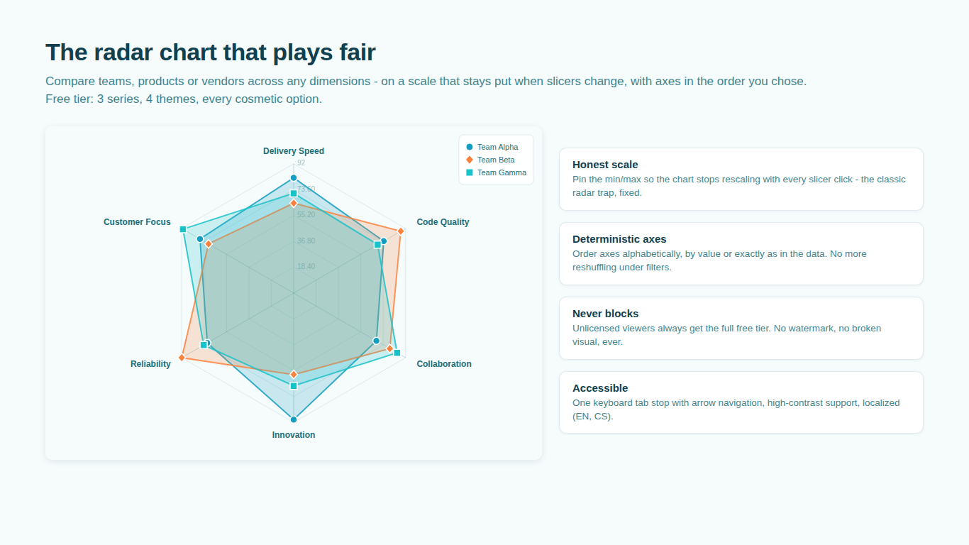
Why your Power BI radar chart changes shape every time you click
A radar chart draws one polygon per series over a set of axes that share a centre. The reader compares shapes: this team is strong on the left and weak at the bottom; this product is a bigger polygon than that one. The comparison only works if the grid under the shapes is the same grid every time. In most Power BI radar visuals it is not, and the reason is autoscaling.
What autoscaling does under a slicer
Nearly every radar visual, the free ones included, sets the axis maximum to the largest value currently on screen. With all regions selected, the maximum on the Revenue axis might be 120 because one region is an outlier. Filter to EMEA, where the biggest value is 60, and the maximum becomes 60. The EMEA polygon now reaches the outer ring where a moment ago it reached halfway. Nothing about EMEA changed; the ruler did.
This gets worse with several axes, because each axis rescales independently. A slicer click can stretch two axes and compress three, so the polygon changes shape, not only size. The shape is what people remember from a radar chart, so the thing they remember is an artefact of the filter state. If the dashboard has ever looked different from the deck built from a screenshot of it, this is the mechanism.
Percentages do not help. A skills matrix scored 0 to 100 with a top score of 74 autoscales to 74, and every polygon looks nearly full. Nobody sees that the whole team is under three quarters.
Pin the minimum and the maximum
The fix is to treat the scale as a decision made once, from what the numbers mean, rather than as a side effect of the data on screen. Scores out of 100 get 0 to 100. Likert items get 1 to 5, or 1 to 7. Percentages get 0 to 100 unless there is a good reason to zoom in, and if there is, say so on the chart. Currency and counts get a maximum chosen from the full unfiltered range, rounded up so the ticks land on round numbers.
Start at zero unless you have a reason not to. A radar chart encodes value as distance from the centre, and the eye reads the area of the polygon, which grows with the square of that distance. An axis that starts at 40 instead of 0 turns a 10 percent difference in the numbers into a visual difference several times larger. Bar charts have the same rule for the same reason.
Power BI has no native radar chart, and neither Microsoft's own free radar visual nor the other free radar visuals on the marketplace let you fix the axis maximum. The request has been on the community forums since 2017 and is still open. The workaround people use is a fake series with the intended maximum on every axis, coloured transparent. It works until someone deletes the fake row.
Keep the axis order stable
The second thing that changes under a slicer is the order of the axes. Most visuals draw axes in the order the data arrives, which after a filter is whatever order the query returned. Two adjacent axes form one edge of the polygon, so reordering axes changes the shape as much as rescaling them does.
Decide the order once and keep it. The usual choices are the order of the model (which you control through Sort by column), alphabetical, or sorted by the first series so the polygon has one large side and one small side and reads like a ranked list. Any of these is fine; an order that depends on the filter is not.
Mixed units and normalization
A vendor scorecard has price in dollars, delivery time in days, defect rate in percent and a satisfaction score out of 10. Those cannot share one scale, and a radar that draws them on one scale puts the dollar axis at the outer ring and everything else at the centre.
The answer is to rescale each axis before drawing, and there are four sensible ways to do it.
| Method | What it does | Use when | Watch out for |
|---|---|---|---|
| Min-max | Maps each axis from its own minimum and maximum to 0 to 1 | You want a plain "best to worst among these" view | One outlier flattens everyone else; the bounds change when the set changes |
| Percentile rank | Each value becomes its rank among peers, 0 to 100 | Comparing an entity to a population (player profiles, benchmarking) | Needs enough peers; clamping at the 5th and 95th percentile stops outliers dominating |
| Z-score | Value minus the mean, divided by the standard deviation | The spread matters more than the range | Negative values need an axis that starts below zero; hard to explain to a general audience |
| Percent of target | Value divided by a target set per axis | Every axis has an agreed goal | A missing target on one axis breaks the chart |
Whatever the method, two things must hold. The raw value must stay in the tooltip and on the data label, because nobody can act on "a normalized 0.72" without knowing it was 43 dollars. And axes where lower is better (price, defects, days to deliver) must be inverted before normalization, so that further from the centre always means better. A radar where "out" means good on four axes and bad on two is worse than no radar.
Note that min-max normalization reintroduces the autoscaling problem through the back door: the minimum and maximum are computed from the visible data, so a slicer changes them. If you normalize with min-max, compute the bounds over the full population rather than the filtered one, or accept that the chart answers "among the visible entities" and label it that way.
When the radar is the wrong chart
Two or three polygons on one radar are readable. Six are not: the lines cross, the fills stack into mud and the legend does all the work. Hover-to-isolate helps, but a chart that only works with a mouse over it is not a chart for a printed pack.
The alternatives are honest about what a radar is trying to do:
- Small multiples: one small radar per series on a shared, pinned scale, laid out in a grid. Six profiles become six shapes you can scan, and an average silhouette drawn faintly in each one gives the comparison the overlapping version was reaching for.
- Radial columns: each axis becomes a bar radiating from the centre. There are no connecting lines, so there is no polygon to misread, and adjacent axes stop implying a relationship they do not have.
- A plain clustered bar chart with the axes as categories and one bar per series, which is what a radar is once you unbend it. Less memorable, more accurate.
The standard critique of radar charts is fair: polygon area depends on axis order, adjacent axes suggest a continuity that is not there, and the eye cannot compare distances at different angles. A radar is still the right choice when the reader's task is to recognize a profile, a shape, rather than to read values, and when the number of series is small. Outside those conditions, use one of the alternatives.
Doing this in Power BI
SmartVisuals Radar Chart was built around this list. The free tier includes a fixed axis minimum and maximum on a shared scale, a start-at-zero toggle, tick count, and axis ordering that keeps model order under filtering or sorts alphabetically, by first series or by a custom order. Up to three series render with every cosmetic option, and hovering a legend entry isolates one series.
The premium tier adds the rest of this article: unlimited series, independent per-axis bounds, inverted axes, normalization by min-max, percentile (with 5th and 95th percentile clamping) or z-score with real values kept in tooltips and labels, a target polygon and zone bands, and the alternatives for when polygons overlap, in the form of small multiples with an average silhouette, radial columns, lollipops and a percentile slice mode. Every premium feature previews in edit mode, and an unlicensed viewer sees the first three series rather than a broken visual.
Try AI Chatbot for Free
Experience the power of conversational analytics in your Power BI reports. Get your free license in seconds - no credit card required.
Get Free License