Visuals/Pl. II

    Radar Chart

    The radar chart that plays fair

    Compare teams, products, vendors or KPIs across any number of dimensions — on a scale that stays put when slicers change, with the analytical depth the built-in options never had.

    Datasheet
    Status
    Available on Microsoft AppSource
    Price
    $1.99 /user/mo · $19 /user/yr
    Licensing
    Per user, assigned in the Microsoft 365 admin center. Unlicensed viewers see the free tier, never a blocked visual.
    Data
    Computed inside Power BI. No external calls, no API keys, no telemetry.
    Visuals API
    5.11
    Accessibility
    Single-tab-stop keyboard navigation, cross-highlight, high-contrast mode
    Languages
    English, Czech
    Works in
    Power BI Desktop, Service, Embedded
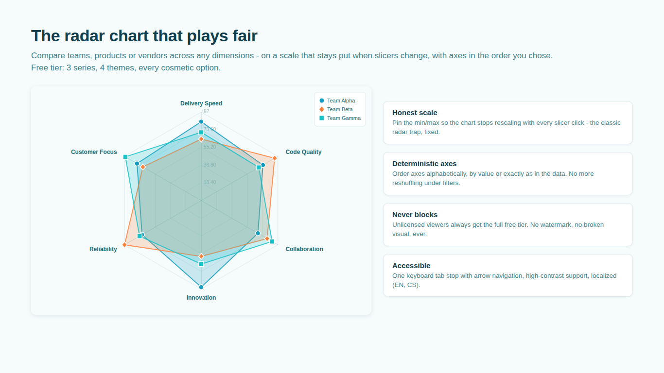
    Power BI radar chart comparing teams on a pinned scale
    Pl. II  ·  Radar Chart  ·  Compare teams across any dimensions on an honest, pinned scale — free tier with 3 series and every cosmetic option.rendered from the shipped visual
    What it does

    Most radar charts rescale with every slicer click, quietly reshaping your story. SmartVisuals Radar Chart is built around honest scale controls: pin the minimum and maximum, start axes at zero, and order axes alphabetically, by value, or exactly as in your data.

    When raw units don't compare — dollars, days and percentages on one chart — per-axis normalization (min-max, percentile rank or z-score) and inverted axes turn an unreadable raw radar into a fair comparison. And when overlapping polygons stop being readable, switch to pizza slices, radial columns or lollipops with one dropdown.

    Free and premium

    Where the line is, exactly.

    Report authors see the full premium set in edit mode, so you can evaluate every feature on your own data before assigning a single licence. Unlicensed viewers always get a working chart.

    Free tierevery viewer
    • Up to 3 series, unlimited axesPlus every cosmetic option: 4 themes, line / area / spline styles, marker shapes, polygon or circle grid, rotation, legend, data labels. Every color, font and shape is yours to override.
    • Honest scale controlsPin the minimum and maximum so the chart stops rescaling with every slicer click — the classic radar trap. Start axes at zero, order axes your way.
    • No lock-out, everUnlicensed viewers always see the full free tier — no watermark, no broken visual, no blocked report.
    • Interactive and accessibleCross-filtering, multi-select, drill-down on axis hierarchies, tooltips on points and whole axes, one keyboard tab stop with arrow navigation, high-contrast and reduced-motion support.
    Premium$1.99 /user/mo · first month free
    • 4 or more seriesCompare as many teams or products as your story needs, or split one measure by a Legend field.
    • Normalization for mixed unitsMin-max, percentile rank or z-score per axis, so speed, price and NPS compare fairly on one chart.
    • Inverted axesMark axes where lower is better (price, error rate) so "further out" always means "better".
    • Target polygon, zones and benchmarkJudge every series against a dashed goal shape, red/amber/green value rings, a reference line and the min-max envelope or average of the visible series.
    • Chart modesWhen polygons overlap, switch to pizza slices with value chips, radial columns, or lollipops — one dropdown, same fields.
    • Small multiplesOne mini radar per series on a shared scale, each carrying the dashed average silhouette of the field.

    Why radar charts in Power BI keep changing shape

    Most radar visuals fit the scale to whatever data is on screen. Click a slicer, the maximum changes, and the same team now looks twice as strong or twice as weak. The shape you presented last week is not the shape on the dashboard today, and nobody can tell why.

    SmartVisuals Radar Chart treats the scale as a decision, not a side effect. Pin the minimum and maximum so every filter state is drawn on the same grid, start axes at zero when the story needs it, and keep axes in the order of your data instead of whatever order the filter returns them in. All of this is in the free tier, because it is what makes a radar chart trustworthy at all.


    Comparing metrics with different units on one radar

    A vendor scorecard with price in dollars, delivery in days and satisfaction as a percentage cannot share one axis scale. Per-axis normalization rescales each dimension before drawing: min-max for a plain 0 to 100 view, percentile rank when you want to know where each entity sits among its peers, or z-score when the spread matters. Percentile mode clamps at the fifth and ninety-fifth percentile so a single outlier does not flatten everyone else.

    Axes where lower is better, such as price or error rate, are marked as inverted, so further out always means better. The real values stay in the tooltips and labels, so nobody has to guess what a normalized 72 was in dollars.

    Targets, zones and benchmarks

    Map a Target field and every series is judged against a dashed goal polygon. Red, amber and green zone bands turn the chart into a maturity or risk scorecard, drawn only where the scale makes them honest. A benchmark band shows the envelope or average of the visible series as instant context, and conditional formatting colours whole series by a rule on their average, minimum, maximum or total.

    When polygons overlap: pizza slices, columns, lollipops and small multiples

    Six overlapping polygons are a spaghetti plot, whatever the colours. Hovering a legend entry isolates one series and dims the rest, which is often enough. When it is not, one dropdown switches the same fields into pizza slices with value chips, the football-scouting look, into radial columns, or into lollipops.

    Small multiples draw one mini radar per series on a shared scale, each carrying the dashed average silhouette of the field, so a page of eight profiles reads at a glance and still lets you spot who is above average where.

    What three free series cover, and where premium starts

    The free tier renders up to three series with unlimited axes, every cosmetic option and all the scale controls. That covers a single-entity profile and simple comparisons. Comparing many entities, which is the core purpose of a radar chart, needs the premium licence, as do normalization, inverted axes, targets, zones, benchmarks, chart modes and small multiples.

    An unlicensed viewer still sees the first three series plus the standard Power BI licence banner, never a broken visual, and every premium feature previews free while you edit the report.

    Where it gets used

    Skill matrices and 360 feedback in HR, vendor and product scorecards in procurement, player profiles in sports analytics, maturity assessments in consulting, and any competitive comparison where several dimensions have to be read together rather than as six separate bar charts.

    Getting started

    From empty canvas to first chart.

    1. 01

      Map a category to Axis and one or more measures to Values — that alone renders a working radar.

    2. 02

      Pin the scale minimum and maximum so slicer clicks stop reshaping the chart.

    3. 03

      Mixing units? Turn on normalization and mark lower-is-better axes as inverted.

    4. 04

      Crowded chart? Switch the chart mode or turn on small multiples.

    Get Radar Chart

    Two ways in.

    Installation instructions for both paths are on the download page.

    Microsoft AppSource (recommended)

    Reviewed by Microsoft, updates automatically, licences assigned in the Microsoft 365 admin center.

    Open AppSource

    Direct download (1.0.1.0)

    .pbiviz package, import into Power BI Desktop or Service, does not auto-update. Includes the full free tier; premium features preview in edit mode and are licensed through AppSource.

    Download .pbiviz
    Questions

    Asked before you did.

    More questions? See support or write to hello@smartvisuals.io.

    Missing something?

    Tell us what is missing.

    A feature you need, a bug you hit, a visual that does not exist yet. Every message reaches the person who builds these visuals, and feature requests shape what ships next. We also build visuals to order.

    Also in the family