Cohort retention in Power BI: the DAX recipe, and where it breaks
Search for "cohort analysis Power BI" and you get versions of the same recipe, republished every year or so since 2020. It is a reasonable recipe. It is also long enough that most people copy it without understanding which step does what, and it fails in three places that do not look like failures on screen. This article writes the recipe out in full, then goes through the failures.
The model used here: an Events table with one row per customer event (CustomerID, EventDate, optionally Amount), a Customers dimension with one row per CustomerID related one-to-many to Events, and a standard Date table related to Events[EventDate]. The grain is months. Weeks or days follow the same pattern with different date arithmetic.
Part 1: the first-event column
Cohort analysis starts by asking when each entity was first seen. That is a per-customer minimum over events, which makes it a calculated column on the dimension:
First Event =
CALCULATE ( MIN ( Events[EventDate] ) )
Context transition does the work: inside a calculated column on Customers, CALCULATE turns the current row into a filter, so MIN runs over that customer's events only. This column is evaluated at refresh and never again, which is convenient (it is fast and it does not move) and is also the root of the third failure below.
Part 2: the cohort key
The cohort is the first event truncated to the grain. For months:
Cohort Month =
DATE ( YEAR ( Customers[First Event] ), MONTH ( Customers[First Event] ), 1 )
Keep it a real date rather than a text label like "2026-03". A date sorts correctly in the matrix, formats through the format string, and can be compared arithmetically in the measures that follow. If you want "Mar 2026" on the row header, set the format string on this column; do not build a second text column and forget to sort it.
Part 3: the disconnected period table
The columns of the triangle are period offsets (0, 1, 2 and so on, months since the cohort month), not calendar months. There is no such column in the model, so you create one:
Period Offset =
SELECTCOLUMNS (
    GENERATESERIES ( 0, 24, 1 ),
    "Offset", [Value]
)
GENERATESERIES returns a single column named Value; the SELECTCOLUMNS only renames it. The table must stay disconnected: no relationship to anything. It exists so that a matrix can put its values across the columns and a measure can read which column it is in.
Part 4: the offset measure
This is the part that does the work. For each matrix cell, read the cohort month from the row, read the offset from the column, compute the calendar window that offset refers to, and count the customers with an event in it:
Active Customers =
VAR Offset = SELECTEDVALUE ( 'Period Offset'[Offset] )
VAR CohortStart = SELECTEDVALUE ( Customers[Cohort Month] )
VAR PeriodStart = EOMONTH ( CohortStart, Offset - 1 ) + 1
VAR PeriodEnd = EOMONTH ( CohortStart, Offset )
RETURN
    CALCULATE (
        DISTINCTCOUNT ( Events[CustomerID] ),
        REMOVEFILTERS ( 'Date' ),
        Events[EventDate] >= PeriodStart,
        Events[EventDate] <= PeriodEnd
    )
EOMONTH is doing the calendar arithmetic. EOMONTH ( CohortStart, Offset - 1 ) + 1 is the first day of the month Offset months after the cohort month; EOMONTH ( CohortStart, Offset ) is the last day of that month. This is why the recipe uses EOMONTH rather than adding 30 times Offset days: months have different lengths, and adding days drifts by a day or two per period until customers land in the wrong column.
The row filter on Customers[Cohort Month] flows through the relationship to Events, so the count is already restricted to customers in that cohort. REMOVEFILTERS ( 'Date' ) is there because the period window is defined by the measure, not by the page; leave it out and any date slicer on the page will cut holes in the triangle.
The denominator and the rate:
Cohort Size =
DISTINCTCOUNT ( Customers[CustomerID] )

Retention % =
DIVIDE ( [Active Customers], [Cohort Size] )
Cohort Size counts from the dimension, not from Events, so a customer with one event still counts once, and it ignores the period column because that table is disconnected.
Part 5: the future-period mask
A cohort acquired in June 2026 has no month 6 yet. Without a guard, Active Customers returns 0 for that cell, DIVIDE returns 0%, and the bottom-right of the triangle fills with zeros. The mask blanks any period whose start is after the last date in the data:
Retention % =
VAR Offset = SELECTEDVALUE ( 'Period Offset'[Offset] )
VAR CohortStart = SELECTEDVALUE ( Customers[Cohort Month] )
VAR PeriodStart = EOMONTH ( CohortStart, Offset - 1 ) + 1
VAR AsOf = CALCULATE ( MAX ( Events[EventDate] ), REMOVEFILTERS () )
RETURN
    IF (
        PeriodStart <= AsOf,
        DIVIDE ( [Active Customers], [Cohort Size] )
    )
IF with no else branch returns BLANK, and the matrix hides blank cells, which is what gives you the triangle shape. Put Customers[Cohort Month] on rows, 'Period Offset'[Offset] on columns, Retention % in values, add a colour scale, and you have the standard result.
That is the recipe. It is correct as far as it goes. Now the three places it stops being correct.
Failure 1: unobserved periods rendered as zero
The mask above catches periods that have not started. It does not catch the period that has started and not finished. If the data runs to 12 September, the September cell of every cohort is computed over twelve days and rendered exactly like a full month. Every cohort's newest cell is understated, the period average row (if you added one) drops at the right edge, and someone reads a retention collapse that is really a calendar artefact.
The fix is a second condition: treat a period as complete only if PeriodEnd <= AsOf, and either blank the partial cell or mark it. Blanking loses information people want, since the current month is the one they ask about. Marking requires either a second measure driving conditional formatting or a suffix in a text measure, and most people never get that far.
There is a subtler version of the same fault. If you skip the mask entirely and rely on the colour scale to make the zeros look empty, the zeros still participate in every average, every total and every scale range. The triangle looks right and every number derived from it is wrong.
Failure 2: the denominator is never named
Retention % above divides by the cohort base: everyone who joined in that month. That is one of at least three legitimate choices.
| Denominator | Question it answers | Month 3 reads as |
|---|---|---|
| Cohort base | What share of the original cohort is still here? | active(3) / cohort size |
| Previous period | Of those here last month, how many stayed? | active(3) / active(2) |
| Surviving base | Of those who never lapsed, how many renewed? | chain(3) / chain(2) |
The three produce different numbers from the same data, and all of them are called "retention" in the measure name. When two teams show different month-3 figures at the same meeting, this is the usual reason, and the DAX gives no clue: the denominator is a detail of one measure that nobody opens. A retention chart should carry the name of its denominator on screen, in the title or a subtitle, and the standard recipe has nowhere to put it. The same applies to the retention definition itself (classic, rolling or sequential), which is a subject for a separate article.
Failure 3: the date slicer reassigns cohorts
The calculated column is evaluated at refresh. That makes it stable, which is good, and frozen, which is not always what people want. The moment someone asks "cohort customers by their first purchase of product X" or "treat a customer as new again after twelve months of silence", the column has to become a measure:
First Event (dynamic) =
MINX (
    VALUES ( Customers[CustomerID] ),
    CALCULATE ( MIN ( Events[EventDate] ) )
)
Now the first event is computed in the filter context of the page. A date slicer set to the last six months makes every customer's first event within that window their first event. Long-standing customers become new customers, the oldest visible cohort is suddenly huge, and the retention of every cohort looks better than it is, because the "new" customers are loyal ones. Nothing on the page indicates this has happened.
The same failure creeps into the calculated-column version through Cohort Size, if the Date table filters Customers through a bidirectional relationship, or if someone replaces REMOVEFILTERS ( 'Date' ) with a narrower filter to make the slicer "work". The general rule: the cohort assignment must be computed over the unfiltered event history, and every slicer on the page is a way to break that rule without noticing.
Doing it without DAX
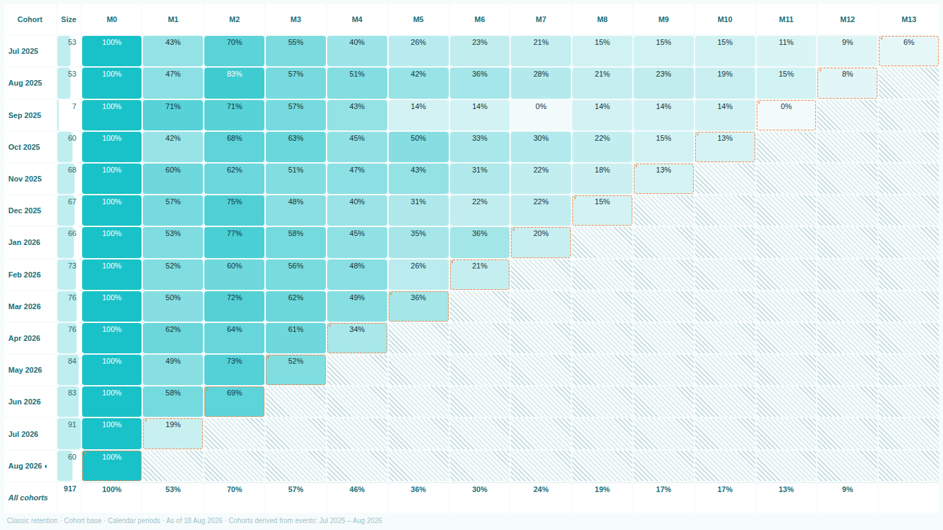
SmartVisuals Cohort Retention exists because the recipe is a stable body of work that every author rebuilds, and the three failures above are in every rebuild. The visual takes an entity field and an event date field and derives the rest: first event, cohort key, period offset, denominator and rate. There is no period table to create and no measure to maintain.
The three failures are handled by design rather than by documentation. Cells beyond a cohort's observed lifetime are hatched and excluded from every average and from the colour scale; partial periods are outlined, flagged in the tooltip and excluded from averages by default. The denominator in use (cohort base, previous period, surviving base or observed base) and the retention definition (classic, rolling, sequential) are written on the chart, so a screenshot carries its own definition. For the slicer problem, the header states the derived cohort range so a shifted window is visible, and an optional Cohort Date field lets you bind a model-computed first-event date that wins over the derived one when you need filter stability. A minimum base setting replaces percentages on tiny cohorts with the count.
All of that is in the free tier. When the model is too large to send entity-level rows to a visual, a pre-aggregated mode accepts a cohort key, a period index and an active count instead, and renders the same triangle. Premium adds the value layer: net revenue retention, revenue per active entity and lifetime-value curves. The correctness pieces stay free in every tier.
Try AI Chatbot for Free
Experience the power of conversational analytics in your Power BI reports. Get your free license in seconds - no credit card required.
Get Free License