
Visuals/Pl. VIII

    NPS

    NPS with the statistics behind it

    Headline score, promoter / passive / detractor split and the trend over waves, with a significance test of every wave-over-wave change, so a +3 is reported as noise when it is noise. Map Score and a Value; add Wave for the trend.

    Datasheet
    Status
    Available on Microsoft AppSource
    Price
    $1.99 /user/mo · $19 /user/yr
    Licensing
    Per user, assigned in the Microsoft 365 admin center. Unlicensed viewers see the free tier, never a blocked visual.
    Data
    Computed inside Power BI. No external calls, no API keys, no telemetry.
    Visuals API
    5.11
    Accessibility
    Single-tab-stop keyboard navigation, Windows high contrast, captions read by screen readers
    Languages
    English, Czech
    Methodology
    Published at /research/methodology; engine validated against R and scipy
    Works in
    Power BI Desktop, Service, Embedded
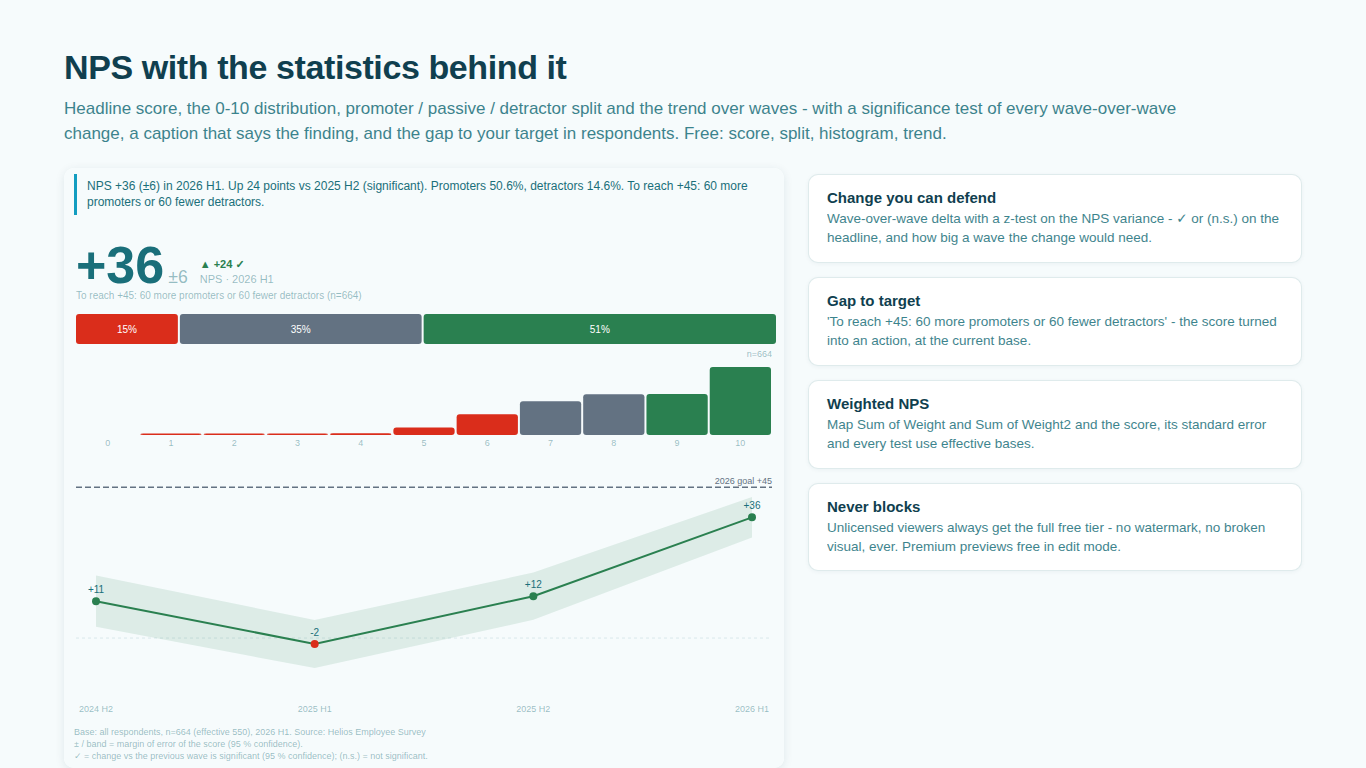
    NPS visual in Power BI with margin of error, tested wave-over-wave change, histogram and trend
    Pl. VIII  ·  NPS  ·  Headline score with its margin of error and the tested wave-over-wave delta, the 0 to 10 histogram, split bar, trend with a confidence band, the gap to target, smart caption and footnote.rendered from the shipped visual
    What it does

    SmartVisuals NPS is the Net Promoter Score panel for Power BI that knows its own margin of error. Map the 0 to 10 answer and a value and you get the headline score as a number, badge or face, the split, the histogram, bases and the change against the previous wave, the first wave or your target. Add a Wave field and the trend comes with a confidence band and a rolling average. The gap to target is written as an action: how many more promoters or fewer detractors it takes at the current base.

    The premium tier is the inference: a z-test on the NPS variance behind every wave-over-wave change, segments with letters and tested movement, weighted NPS on Kish effective bases and a target line on the trend. Every number is computed offline inside the visual, the methodology is published, and the engine is validated against R and scipy.

    Free and premium

    Where the line is, exactly.

    Report authors see the full premium set in edit mode, so you can evaluate every feature on your own data before assigning a single licence. Unlicensed viewers always get a working chart.

    Free tierevery viewer
    • The headlineScore as a number, a badge or a face, coloured by band, placed left, centre or right, counting up when it changes, with its margin of error and the change against the previous wave, the first wave or your target.
    • Split, histogram and trendThe 0 to 10 histogram, the split bar with shares, bases, the wave trend with a confidence band and a three-wave rolling average, an NPS / eNPS / tNPS label and remappable cut-offs.
    • Says the findingA smart caption with the score, the change and whether it is significant, the split, the best and worst segment and the gap to target, offline, in your language; an agency footnote; Quick Styles.
    • Gap to target"To reach +45: 60 more promoters or 60 fewer detractors", the score turned into an action at the current base.
    • Every cosmetic optionFour themes, fonts, bar shapes and three fills of your own. Cross-filtering, tooltips, keyboard navigation and high contrast.
    Premium$1.99 /user/mo · first month free
    • Change you can defendA z-test on the NPS variance behind every wave-over-wave delta: the headline says significant or (n.s.), and how big a wave a non-significant change would need.
    • Segments with letters and movementA split bar, score and tested change since the previous wave per segment, lettered against the others and sortable by movement; low bases hatched and flagged; optional Bonferroni.
    • Weighted NPSMap Sum of Weight and Sum of Weight squared and the score, its standard error and every test use effective bases.
    • Target lineYour target drawn on the trend, with the gap to it in the caption.

    NPS in Power BI: the score is easy, the statistics are not

    Computing a Net Promoter Score in DAX takes three measures: the share of 9s and 10s, the share of 0 to 6, and the difference. What DAX does not give you is the margin of error on that score, or an answer to the question every quarterly review asks: the score moved from 41 to 44, is that real? NPS has an unusual variance, because it is the difference of two proportions from the same sample, and a card visual cannot know it.

    SmartVisuals NPS carries the statistics. Map the 0 to 10 score and a value and the headline appears with its margin of error, the promoter / passive / detractor split and the 0 to 10 histogram. Add a Wave field and every wave-over-wave change is tested, so a +3 is reported as noise when it is noise, and the caption says how big a wave a non-significant change would have needed.


    The headline, the split and the trend

    The score renders as a number, a badge or a face, coloured by band, placed left, centre or right, counting up when it changes. Under it: the margin of error, the change against the previous wave, the first wave or your target, the 0 to 10 histogram, the split bar with shares and bases. The trend over waves comes with a confidence band and a three-wave rolling average.

    Cut-offs are remappable for eNPS or tNPS conventions, and the label follows: NPS, eNPS or tNPS. Four themes, fonts, bar shapes and three fills of your own cover the cosmetics, all free.

    Gap to target: the score as an action

    A target of +45 and a score of +41 is a four-point gap, which tells nobody what to do. The visual turns the gap into respondents at the current base: "To reach +45: 60 more promoters or 60 fewer detractors". The smart caption also names the best and worst segment and whether the last change was significant, offline, in your language, and read out by screen readers.

    Segments with letters and movement

    Add a Segment field in the premium tier and each segment gets its score, its split bar and its tested change since the previous wave, lettered against the other segments and sortable by movement. Low bases are hatched and flagged, Bonferroni correction is optional, and a target line sits on the trend.

    Map Sum of Weight and Sum of Weight squared and the score, its standard error and every test use Kish effective bases, so a weighted CX study reports the same numbers in Power BI as in the agency's tables.

    What the visual expects from your data

    One column with the 0 to 10 likelihood-to-recommend answer and one value, a respondent count or a weight. Wave and Segment are optional grouping fields. The visual works from the raw answers, not from a pre-computed score, which is what lets it compute the variance and the tests. The same engine powers the Likert and Crosstab visuals and the all-in-one SmartVisuals Research visual; the formulas are on the methodology page.

    Getting started

    From empty canvas to first chart.

    1. 01

      Map the 0 to 10 answer to Score and a respondent count (or Sum of Weight) to Value. The headline, split and histogram render.

    2. 02

      Add Wave / Period for the trend with its confidence band and rolling average.

    3. 03

      Set your target and the score cut-offs (NPS, eNPS, tNPS) in the format pane; pick a Quick Style.

    4. 04

      Add Segment and Sum of Weight squared for lettered, weighted segment comparison (premium).

    Get NPS

    Two ways in.

    Installation instructions for both paths are on the download page.

    Microsoft AppSource (recommended)

    Reviewed by Microsoft, updates automatically, licences assigned in the Microsoft 365 admin center.

    Open AppSource

    Direct download (1.0.1.0)

    .pbiviz package, import into Power BI Desktop or Service, does not auto-update. Includes the full free tier; premium features preview in edit mode and are licensed through AppSource.

    Download .pbiviz
    Questions

    Asked before you did.

    More questions? See support or write to hello@smartvisuals.io.

    Missing something?

    Tell us what is missing.

    A feature you need, a bug you hit, a visual that does not exist yet. Every message reaches the person who builds these visuals, and feature requests shape what ships next. We also build visuals to order.

    Also in the family