Visuals/Pl. VII

    Likert

    Likert batteries, done like a research agency

    Diverging stacked bars with the neutral split on the axis, N/A detached, top and bottom box nets, means on the scale, and significance letters between segments on weighted effective bases. Map Question, Answer and a Value; that is the whole setup.

    Datasheet
    Status
    Available on Microsoft AppSource
    Price
    $1.99 /user/mo · $19 /user/yr
    Licensing
    Per user, assigned in the Microsoft 365 admin center. Unlicensed viewers see the free tier, never a blocked visual.
    Data
    Computed inside Power BI. No external calls, no API keys, no telemetry.
    Visuals API
    5.11
    Accessibility
    Single-tab-stop keyboard navigation, Windows high contrast, captions read by screen readers
    Languages
    English, Czech
    Methodology
    Published at /research/methodology; engine validated against R and scipy
    Works in
    Power BI Desktop, Service, Embedded
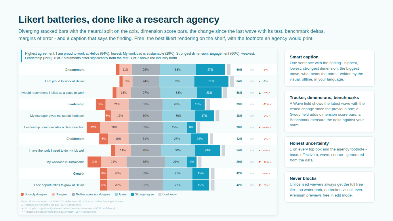
    Likert battery in Power BI in tracker mode with dimension score bars, tested change and benchmark deltas
    Pl. VII  ·  Likert  ·  Employee survey battery in tracker mode: dimension score bars, the tested change since the previous wave, margins of error, benchmark deltas, the smart caption and the footnote.rendered from the shipped visual
    What it does

    SmartVisuals Likert is the battery chart insights teams put in their decks, as a Power BI visual. Diverging stacked bars centred on the axis, the neutral answer auto-centred or placed where you want it, N/A detached with an explicit base choice, top and bottom box nets, means, margins of error, bases per statement and sorting by top box. A tracker mode shows the change since the previous wave, a Group field turns the battery into sections with pooled score bars, and a Benchmark measure shows the delta against your norm.

    The premium tier adds the statistics: segments lettered A/B/C against each other on Kish effective bases, and tests of every statement against the rest of the battery, against your benchmark and against the previous wave. Every number is computed offline inside the visual, the methodology is published, and the engine is validated against R and scipy.

    Free and premium

    Where the line is, exactly.

    Report authors see the full premium set in edit mode, so you can evaluate every feature on your own data before assigning a single licence. Unlicensed viewers always get a working chart.

    Free tierevery viewer
    • The best unweighted Likert rendering on the shelfNeutral auto-centred, custom or none; reverse scale; a collapsed disagree / neutral / agree view; N/A detached with in or out-of-base choice; % labels with a minimum-size threshold; sorting by top box; legend; bases (n=); means; margins of error; an All statements row.
    • Tracker modeAdd a Wave field and the bars show the latest wave with the change of every top box since the previous one.
    • Dimensions and benchmarksA Group field turns the battery into sections with pooled score bars; a Benchmark measure shows the delta against your norm on every statement; a Question Text field carries full wording into tooltips.
    • Says the findingA smart caption with the highest and lowest statement, the strongest dimension and what beats the norm; an agency footnote with base, weighted and effective n and source; Quick Styles.
    • Every cosmetic optionFour themes, fonts, positive / negative / neutral ramps, a colour swatch per answer named by the answer itself, corner radius, bar thickness and gaps between segments.
    Premium$1.99 /user/mo · first month free
    • Segment comparisonAdd a Segment field and every statement splits into groups lettered A/B/C against each other; low bases hatched, flagged with * and excluded from tests; the footer explains the letters.
    • Weighted resultsMap Sum of Weight and Sum of Weight squared and every percentage and test uses Kish effective bases.
    • Vs-total, vs-benchmark and wave testsEach statement's top box tested against the rest of the battery (up / down markers), against your norm (check mark) and against the previous wave, at 90, 95 or 99 % confidence.

    Likert charts in Power BI: where the stacked bar goes wrong

    A Likert battery is usually drawn as a 100 percent stacked bar, and that is where the trouble starts. The neutral answer sits somewhere in the middle of the bar, so agree and disagree cannot be compared across statements. N/A answers are either dropped silently or counted in the base. And a battery of twenty statements sorted by data-load order is a wall, not a chart.

    SmartVisuals Likert draws the battery the way a research agency does: diverging bars centred on the axis with the neutral split in two, N/A detached to the side with an explicit in or out-of-base choice, top and bottom box nets at the ends, means on the scale, and sorting by top box so the strongest statement is at the top. Map Question, Answer and a Value; that is the whole setup.


    Neutral, N/A and reverse scales

    The neutral category can be auto-centred so half sits on each side of the axis, placed at a custom position, or removed from the diverging view. N/A is detached from the bar and you decide whether it counts in the base. Reverse-coded statements can be flipped so that agree always points the same way. Percent labels hide below a minimum segment size so a 2 percent slice does not print over its neighbour.

    A collapsed view reduces the scale to disagree / neutral / agree for executive audiences, and an All statements row summarizes the battery in one bar. Bases (n=), means and margins of error print per statement.

    Tracker mode, dimensions and benchmarks

    Add a Wave field and the bars show the latest wave, with the change of every top box since the previous one next to it. Add a Group field and the battery breaks into sections, Leadership, Tools, Workload, each with a pooled score bar as its header. Add a Benchmark measure and every statement shows its delta against your norm, and a Question Text field carries the full wording into tooltips when your question codes are short.

    Significance letters between segments

    Add a Segment field in the premium tier and every statement splits into groups lettered A/B/C against each other on weighted effective bases: a letter on a group's top box says it is significantly higher than the group carrying that letter. Low bases are hatched, flagged with an asterisk and excluded from testing, and the footer explains the letters.

    Three further tests run per statement: against the rest of the battery (up and down markers), against your benchmark (a check mark) and against the previous wave, at 90, 95 or 99 percent confidence. Map Sum of Weight and Sum of Weight squared and every percentage and test uses Kish effective bases.

    Says the finding, in your language

    The smart caption names the highest and lowest statement, the strongest dimension and what beats the norm, offline, localized, and read out by screen readers. The agency footnote prints base, weighted and effective n and source. Quick Styles switch the whole look between Agency deck, Executive summary and Compact tracker in one click, and every cosmetic option stays free: four themes, fonts, positive, negative and neutral ramps, a colour swatch per answer named by the answer itself, corner radius, bar thickness and gaps.

    Getting started

    From empty canvas to first chart.

    1. 01

      Map Question, Answer (scale) and Value (respondent count, or Sum of Weight for weighted results). Sort the answer field by column so the scale is in order.

    2. 02

      Choose the neutral handling, N/A base rule and sorting in the format pane, or pick a Quick Style.

    3. 03

      Add Wave / Period for tracker mode, Dimension / Group for sections and Benchmark (top box) for your norm.

    4. 04

      Add Segment (comparison) and Sum of Weight squared for lettered, weighted comparisons (premium).

    Get Likert

    Two ways in.

    Installation instructions for both paths are on the download page.

    Microsoft AppSource (recommended)

    Reviewed by Microsoft, updates automatically, licences assigned in the Microsoft 365 admin center.

    Open AppSource

    Direct download (1.0.1.0)

    .pbiviz package, import into Power BI Desktop or Service, does not auto-update. Includes the full free tier; premium features preview in edit mode and are licensed through AppSource.

    Download .pbiviz
    Questions

    Asked before you did.

    More questions? See support or write to hello@smartvisuals.io.

    Missing something?

    Tell us what is missing.

    A feature you need, a bug you hit, a visual that does not exist yet. Every message reaches the person who builds these visuals, and feature requests shape what ships next. We also build visuals to order.

    Also in the family