
Visuals/Pl. III

    Cohort Retention

    Cohort retention triangles from raw events. No DAX, no period table.

    Bind an entity and an event date — that is the whole setup. The visual derives cohorts, offsets and denominators for you, and is honest about what is unobserved.

    Datasheet
    Status
    Available on Microsoft AppSource
    Price
    $1.99 /user/mo · $19 /user/yr
    Licensing
    Per user, assigned in the Microsoft 365 admin center. Unlicensed viewers see the free tier, never a blocked visual.
    Data
    Computed inside Power BI. No external calls, no API keys, no telemetry.
    Visuals API
    5.11
    Validation
    226 tests against independent pandas and scipy references
    Works in
    Power BI Desktop, Service, Embedded
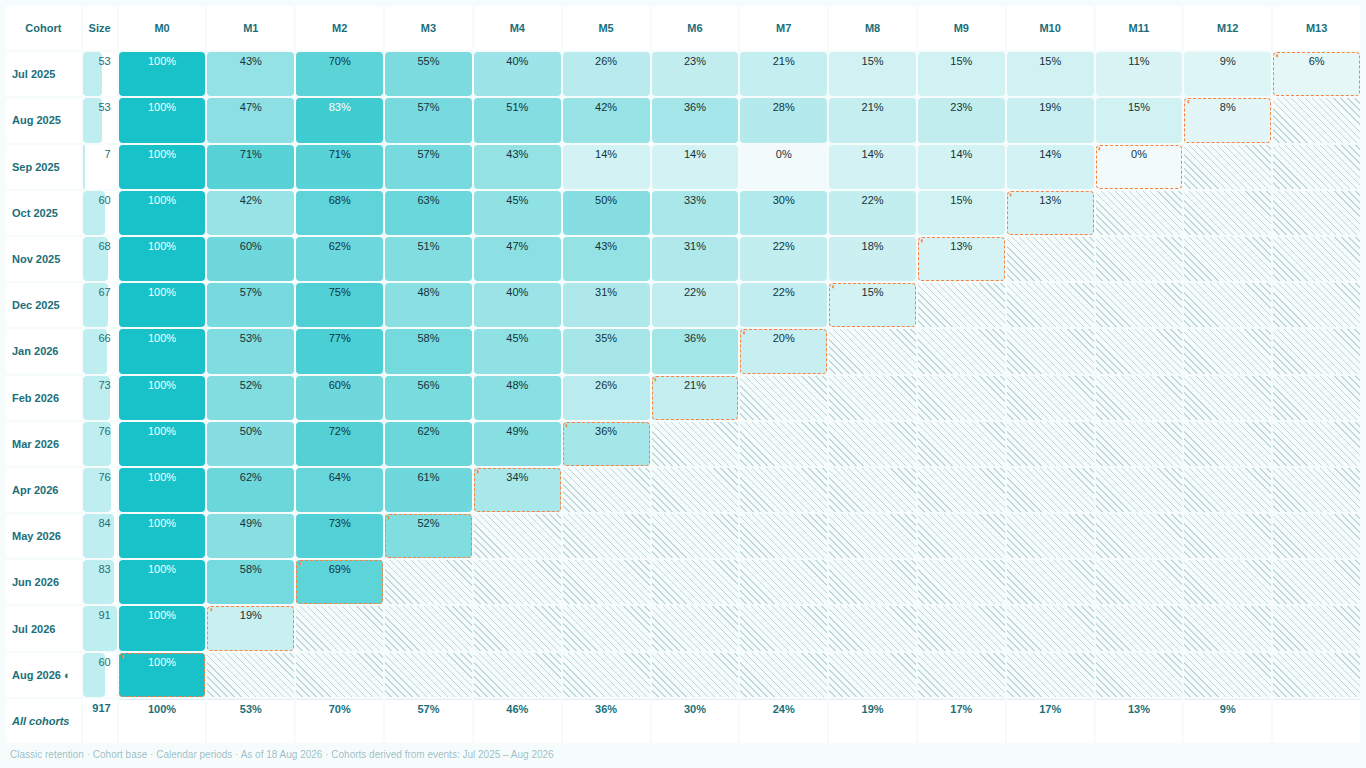
    Cohort retention triangle in Power BI derived from raw events
    Pl. III  ·  Cohort Retention  ·  The triangle, derived from two fields. Unobserved cells are hatched, never zero.rendered from the shipped visual
    What it does

    SmartVisuals Cohort Retention derives the first-event date, the cohort, the period offset and the denominator for you, and it tells you which denominator it used. The five-part DAX recipe that cohort analysis usually needs — a first-event calculated column, a cohort key, a disconnected period table, an offset measure and a future-period guard — becomes unnecessary.

    A cohort table is easy to get wrong in ways that look right. This one is built around not doing that: unobserved cells are hatched, never rendered as zero; incomplete periods are outlined and excluded from averages by default; cohorts with too few entities show their base count instead of a meaningless percentage; and the denominator is named on screen, in a status strip that survives export.

    This is the analysis teams rebuild by hand in a spreadsheet every month. One license replaces the spreadsheet.

    Free and premium

    Where the line is, exactly.

    Report authors see the full premium set in edit mode, so you can evaluate every feature on your own data before assigning a single licence. Unlicensed viewers always get a working chart.

    Free tierevery viewer
    • No DAX and no period tableBind an entity and an event date, nothing else. Works on raw events, or on pre-aggregated data when the model is too large to send entity-level rows.
    • It does not lieUnobserved cells are hatched, never zero. Incomplete periods are marked and excluded from averages. Low-base cohorts show their base count instead of a misleading percentage.
    • Four denominators, three definitionsCohort base, observed base, previous period, surviving base; classic, rolling and sequential retention — with the active choice named on screen. Calendar or anniversary alignment, day to fiscal-year grain.
    • Three views of one aggregationThe retention triangle, survival curves per cohort, and a layer cake of active entities over calendar time — the picture that answers whether growth is new business or retention.
    • Built for reports, not demosCross-filtering from any cell, cohort label or period header. Full keyboard navigation with a single tab stop, high contrast support, English and Czech.
    Premium$1.99 /user/mo · first month free
    • Follow the moneyValue retention (net revenue retention), revenue per active entity, and the cumulative lifetime value curve per cohort.
    • Know when acquisition pays offType in your acquisition cost and the visual marks the period each cohort repays it.
    • Compare what mattersSegments side by side on one colour scale, with significance markers that separate a real gap from noise.
    • Judge against a standardOverlay your best, median or first cohort — or a target you type in — and tint every cell by its distance from the benchmark.
    • Read the cause, not just the numberThe age-vs-calendar panel separates "these cohorts are worse" from "that month was bad for everyone", and the insights strip names the best cohort, the worst, and the trend.
    • See past the edge of your dataRetention projection with a shifted-beta-geometric model, validated against the published Fader and Hardie reference.

    Cohort retention in Power BI without DAX

    The standard way to build a retention triangle in Power BI is a five-part DAX recipe that has been republished by different authors every year since 2020: a calculated column for each entity's first event, a cohort key, a disconnected period table built with GENERATESERIES, an offset measure combining EOMONTH and SELECTEDVALUE, and a mask for periods that have not happened yet. It works when every part is right, and every asker on the forums gets the same three parts wrong.

    SmartVisuals Cohort Retention removes the recipe. Bind an entity, such as a customer ID or a user ID, and an event date. The visual derives the first-event date, the cohort, the period offset, the denominator and the retention rate, and draws the triangle. If you still need a period table, the visual has failed at its job.


    Three retention definitions, because they are three different questions

    Classic retention counts an entity as active if it had at least one event in exactly that period; it is what e-commerce and SaaS teams usually mean. Rolling retention counts an entity as active in a period if it had an event then or in any later period; it can only go down, and it is what D7 or D30 retention means in mobile and games. Sequential retention requires activity in both the period and the one before it, which is the right frame for renewal and churn chains.

    The visual offers all three and names the active one in its subtitle, not only in the format pane, so a screenshot in a board pack carries its own definition.

    Denominators, named on screen and free forever

    Retention is active entities divided by a denominator, and the denominator is where cohort charts quietly disagree. Cohort base is the classic triangle. Previous period gives period-over-period retention. Surviving base follows the sequential rule for renewal chains, and observed base counts only entities that could still have been seen. All four are available in every tier and the chosen one is written on the chart, because both a wrong denominator and an unlabelled one produce a chart that lies.

    The observation window: where homemade cohort tables lie

    A cohort acquired four months ago has no month-twelve retention yet. A spreadsheet or a DAX matrix reports that as zero, the average for month twelve collapses, and someone concludes retention has crashed. In this visual, unobservable cells are hatched and excluded from every average and from the colour scale. Periods that have started but not finished are outlined, flagged in the tooltip and left out of averages by default. The most recent cohort, which is still recruiting, is flagged the same way.

    Cohorts with too few entities produce meaningless percentages, so a minimum base setting suppresses those cells and shows the base count instead of a rate.

    Date slicers and cohort assignment

    A visual only sees the data the page sends it. Set a date slicer to the last six months and every entity's first event within that window becomes its first event, so the triangle silently becomes something else. No visual can fix this from the inside, so this one makes it visible instead: the header states the derived cohort range, and an optional Cohort Date field lets you bind a model-computed, filter-stable first-event date that always wins.

    From counts to money

    With a value field mapped, the premium tier turns the triangle into net revenue retention, revenue per active entity and a cumulative lifetime-value curve per cohort. Type in an acquisition cost and the visual marks the period in which each cohort pays it back. Segments compare side by side on one colour scale with significance markers that separate a real gap from noise, a benchmark overlay tints every cell by its distance from your best, median or first cohort, and the age-versus-calendar panel separates a weak cohort from a bad month for everyone.

    Beyond the observed window, a shifted-beta-geometric projection, validated against the published Fader and Hardie reference, draws where retention is heading. The whole engine is tested against independent pandas and scipy implementations, and the test record ships with the visual.

    Large models: pre-aggregated mode

    When the model is too large to send entity-level rows to a visual, switch to pre-aggregated mode and feed cohort-period rows with their counts instead. The triangle, curves and layer cake render the same way; only the derivation step is skipped.

    Getting started

    From empty canvas to first chart.

    1. 01

      Bind an entity (customer ID, account, user) and an event date. That is the whole setup.

    2. 02

      Pick a denominator and a retention definition — the active choice is always named on screen.

    3. 03

      Add a value field to unlock revenue retention, LTV curves and payback markers (premium).

    4. 04

      Model too large? Switch to pre-aggregated mode and feed cohort-period rows instead.

    Get Cohort Retention

    Two ways in.

    Installation instructions for both paths are on the download page.

    Microsoft AppSource (recommended)

    Reviewed by Microsoft, updates automatically, licences assigned in the Microsoft 365 admin center.

    Open AppSource

    Direct download (1.0.2.0)

    .pbiviz package, import into Power BI Desktop or Service, does not auto-update. Includes the full free tier; premium features preview in edit mode and are licensed through AppSource.

    Download .pbiviz
    Questions

    Asked before you did.

    More questions? See support or write to hello@smartvisuals.io.

    Missing something?

    Tell us what is missing.

    A feature you need, a bug you hit, a visual that does not exist yet. Every message reaches the person who builds these visuals, and feature requests shape what ships next. We also build visuals to order.

    Also in the family