Visuals/Pl. VI

    Crosstab

    The banner table every insights team ships, inside Power BI

    Questions as blocks, segments as columns, column % with A/B/C letters where a cell is significantly higher. Sticky headers, base row, heat shading, and a 30,000-row banner that scrolls like a native table.

    Datasheet
    Status
    Available on Microsoft AppSource
    Price
    $1.99 /user/mo · $19 /user/yr
    Licensing
    Per user, assigned in the Microsoft 365 admin center. Unlicensed viewers see the free tier, never a blocked visual.
    Data
    Computed inside Power BI. No external calls, no API keys, no telemetry.
    Visuals API
    5.11
    Accessibility
    One keyboard tab stop with arrow navigation across cells, Windows high contrast
    Languages
    English, Czech
    Methodology
    Published at /research/methodology; engine validated against R and scipy
    Works in
    Power BI Desktop, Service, Embedded
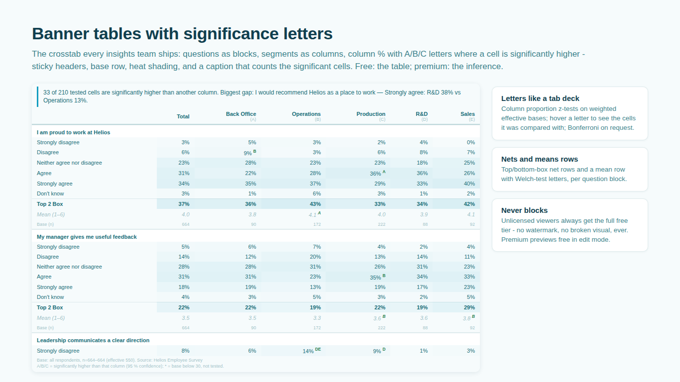
    Survey crosstab in Power BI with significance letters, Top 2 Box and mean rows
    Pl. VI  ·  Crosstab  ·  Banner table by department with letters, Top 2 Box and mean rows, base row, the smart caption and the footnote (premium letters).rendered from the shipped visual
    What it does

    SmartVisuals Crosstab is the survey banner table as a Power BI visual. Map Question, Answer and a Value, add the banner columns, and the table appears with sticky headers, a Total column, a base row per question block, heat shading by share, tooltips and cross-filtering by cell. It is virtualized, so a banner with thousands of rows scrolls like a native table and keeps your place across filters.

    The premium tier is the inference: column proportion z-tests between banner columns with A/B/C letters at 90, 95 or 99 percent confidence, weighted cells on Kish effective bases, top and bottom box net rows and mean rows with Welch-test letters, the index against Total, and a test on every tracker delta. Every statistic is computed offline inside the visual; the methodology is published and the engine is validated against R and scipy.

    Free and premium

    Where the line is, exactly.

    Report authors see the full premium set in edit mode, so you can evaluate every feature on your own data before assigning a single licence. Unlicensed viewers always get a working chart.

    Free tierevery viewer
    • The tableColumn % or values (or both), decimals, a Total column, base row per block, heat shading by share, sticky headers, tooltips and cross-filtering by cell.
    • Tracker modeAdd a Wave field and every cell shows the latest wave with the change since the previous one, plus a trend column.
    • Table toolsSearch, transpose, focus mode, and CSV export that keeps the letters. Row virtualization for a 30,000-row banner.
    • Says the findingA smart caption stating how many cells differ, an agency footnote with base, weighted and effective n, wave and source, and Quick Styles.
    • Every cosmetic optionBuilt-in themes, fonts, shading ramps, and a format pane labelled with your real question and column names. English and Czech.
    Premium$1.99 /user/mo · first month free
    • Significance lettersColumn proportion z-tests between banner columns at 90, 95 or 99 % confidence, optional Bonferroni correction, low bases flagged with * and excluded. Never a fabricated significance.
    • Weighted cellsMap Sum of Weight and Sum of Weight squared for Kish effective bases, the SPSS-style convention.
    • Net and mean rowsTop and bottom box nets (one to three points) and mean rows with Welch-test letters, per question block.
    • Index vs Total and tracker testsCells indexed against the Total column with above / below marks, and a test on every change since the previous wave.

    Crosstabs in Power BI: what the matrix visual cannot do

    A survey banner table is a matrix with rules. Questions are stacked as blocks, segments run across as columns, cells show column percentages on a base that is printed under the header, and where a cell is significantly higher than another column it carries that column's letter. The native matrix visual can stack questions and show percentages; it cannot compute a base row per block, cannot weight cells on effective bases, and has no idea what a column proportion test is.

    SmartVisuals Crosstab is that banner table as a visual. Map Question, Answer and Value, add Columns for the banner, and the table appears with sticky headers, a Total column, a base row per block, heat shading by share and cross-filtering by cell. The letters, the weighting and the net and mean rows are the premium layer on top.


    What the A/B/C letters mean

    Each banner column gets a letter. A letter inside a cell says that this cell's percentage is significantly higher than the same cell in the column with that letter, at the confidence level you chose: 90, 95 or 99 percent. The test is a two-sample z-test on column proportions, the SPSS-style convention, with optional Bonferroni correction for the number of comparisons in a block.

    Columns with a base below your threshold are flagged with an asterisk and excluded from testing, so a letter never appears on ten respondents. The footer explains the letters and marks, and the rule is printed, not implied. The full method, including the documented column-overlap limitation, is on the methodology page.

    Weighted cells and effective bases

    Weighted surveys need two things from a table: percentages on the weighted counts and tests on the effective base, not the weighted one. Map Sum of Weight as the value and Sum of Weight squared next to it, and the visual computes the Kish effective base per column, n_eff = (Σw)² / Σw², and runs every test on it. The footnote prints unweighted, weighted and effective n side by side.

    Unweighted tables work with a plain respondent count and no second measure; the letters then use the raw base.

    Nets, means and the index against Total

    Top box and bottom box net rows summarize a scale question in one line, one to three scale points each, and carry their own letters. Mean rows put the scale mean under the block with Welch-test letters between columns. An index view shows each cell against the Total column, with diverging shading and marks for cells above or below the rest of the sample.

    Tracker mode, search, export and 30,000 rows

    Add a Wave field and the table shows the latest wave with the change since the previous one in every cell, plus a trend column; each delta is tested in the premium tier. A search box finds a question or answer in a long banner, transpose swaps rows and columns, focus mode isolates one block, and CSV export writes the table with its letters so it can go into a deck or a client file.

    The table is virtualized, so a 30,000-row banner scrolls like a native table and keeps your place across cross-filters. The smart caption says how many cells differ, the agency footnote prints base, weighted and effective n, wave and source, and Quick Styles set the look in one click.

    Getting started

    From empty canvas to first chart.

    1. 01

      Map Question, Answer and Value (respondent count, or Sum of Weight for weighted results). The table renders with a Total column and base row.

    2. 02

      Add Columns (banner) for the segments you compare across.

    3. 03

      Add Sum of Weight squared to enable effective bases and the letters (premium), and Wave / Period for tracker mode.

    4. 04

      Turn on net rows, mean rows or the index view in the format pane; pick a Quick Style.

    Get Crosstab

    Two ways in.

    Installation instructions for both paths are on the download page.

    Microsoft AppSource (recommended)

    Reviewed by Microsoft, updates automatically, licences assigned in the Microsoft 365 admin center.

    Open AppSource

    Direct download (1.0.1.0)

    .pbiviz package, import into Power BI Desktop or Service, does not auto-update. Includes the full free tier; premium features preview in edit mode and are licensed through AppSource.

    Download .pbiviz
    Questions

    Asked before you did.

    More questions? See support or write to hello@smartvisuals.io.

    Missing something?

    Tell us what is missing.

    A feature you need, a bug you hit, a visual that does not exist yet. Every message reaches the person who builds these visuals, and feature requests shape what ships next. We also build visuals to order.

    Also in the family