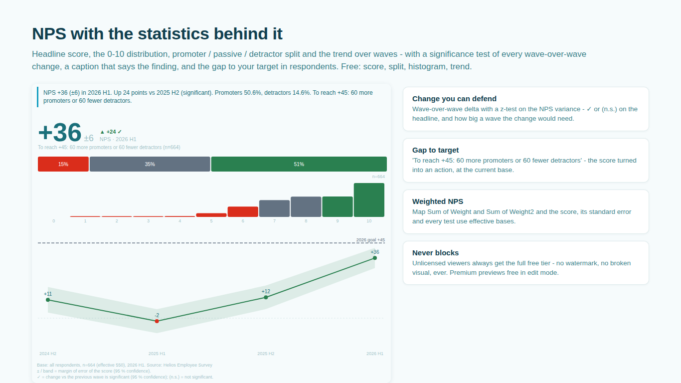
Your NPS went up by 3. Is that real?
A Net Promoter Score card on a dashboard shows one number, usually with an arrow next to it. The number moved from 41 last quarter to 44 this quarter and the arrow points up. Somebody in the review will ask whether the three points are real, and the honest answer depends on two things the card does not show: how many people answered, and how the answers were spread across the 0 to 10 scale. This article works through both, and then through what to do about it in a Power BI report.
What NPS is, as a statistic
NPS is the share of promoters (9 and 10) minus the share of detractors (0 to 6), times 100. Passives (7 and 8) count in the base and nowhere else. That makes NPS a difference of two proportions from the same sample, and the two proportions are not independent: every respondent is exactly one of promoter, passive or detractor, so more promoters means fewer of the other two.
The variance of the score follows from that. With promoter share p and detractor share d and base n:
Var(NPS) = ( p + d − (p − d)² ) / n
SE(NPS)  = 100 · sqrt( Var )
The term in the middle, p + d minus the square of the score, is what a plain proportion calculator misses. Treating NPS as one proportion, or as the sum of two independent proportion variances, gets the standard error wrong in both directions depending on the mix. The formula above is the multinomial one, and it is what the published SmartVisuals methodology uses.
A worked example
Suppose 400 people answered this quarter: 200 promoters, 120 passives, 80 detractors. Then p = 0.50, d = 0.20, NPS = 30.
Var = ( 0.50 + 0.20 − 0.30² ) / 400 = ( 0.70 − 0.09 ) / 400 = 0.001525
SE  = 100 · sqrt( 0.001525 ) ≈ 3.9
At 95 percent confidence the margin of error is about 1.96 times that, roughly plus or minus 7.7 points. The headline should read 30 ± 8, not 30. With 400 respondents, which is a respectable wave for a B2B survey, the score is known to within eight points either way.
Now the change. Last quarter's wave had 380 respondents and a score of 27 with a standard error of, say, 4.1. The test for a wave-over-wave change is a z-test on the difference of two independent estimates:
z = ( 30 − 27 ) / sqrt( 3.9² + 4.1² ) = 3 / 5.66 ≈ 0.53
A z of 0.53 is nowhere near the 1.96 needed for significance at 95 percent. The three-point rise is consistent with no change at all. Reporting it as an improvement is reporting noise.
How big a wave would it have taken?
The useful follow-up is not "so the survey is pointless" but "how many respondents would we need to detect a change of this size". With the variance term averaged over the two waves and two equal samples of size n, the standard error of the difference is 100 times the square root of 2v over n, so:
n = 2v · ( 100 · 1.96 / 3 )²
With v around 0.61 that comes to roughly 5,200 respondents per wave to call a three-point change significant at 95 percent. That is the honest planning number for a tracker that wants to react to moves of three points, and it explains why most trackers should read changes of three points as flat.
Weighted surveys
Most customer surveys are weighted to the customer base, by segment, region or account size. The weight does not change the formulas above, but it changes n. The right base for the variance is not the number of respondents and not the sum of weights, but the effective base:
n_eff = ( Σw )² / Σw²
which is smaller than the respondent count whenever weights vary. A wave of 400 respondents with uneven weights might have an effective base of 280, and the margin of error grows accordingly. If a report shows a weighted NPS with a margin of error computed on the raw count, the margin is too small.
Doing this in Power BI
The score itself is three DAX measures. The margin of error is one more, if you carry the promoter and detractor shares into it. The test between two waves needs the standard error of each wave in the same filter context, which is a measure that has to evaluate the previous wave through a time-intelligence pattern, and then a card or a table to show the verdict. The effective base needs the sum of squared weights, which most models do not have. It is all doable, and it is the kind of DAX that lives in one report because nobody wants to move it.
The alternative is to let the visual do it, which is why SmartVisuals NPS takes the raw 0 to 10 answers rather than a computed score. From the raw answers it computes the score, its standard error and the confidence band on the trend, tests every wave-over-wave change and writes the verdict into the headline: significant, or (n.s.), with the wave size a non-significant change would have needed. Map Sum of Weight and Sum of Weight squared and every number is on the effective base. Segments get the same treatment, lettered against each other, so the report says which segment actually moved.
The point is not that a three-point change is never real. It is that a dashboard should know whether it is, and say so next to the arrow.
Try AI Chatbot for Free
Experience the power of conversational analytics in your Power BI reports. Get your free license in seconds - no credit card required.
Get Free License