Waffle & Pictogram

    Unit charts that always add up

    Waffle and dot matrix grids allotted by largest remainder, icons per category, isotype rows, icon arrays, parliaments and infographic cards, with targets, free and never watermarked. Premium is what moved: gained and lost cells, survey margins and wave tests, a sample-size planner, seat change and coalitions.

    Read the documentationComing soon to Microsoft Marketplace
    Datasheet
    Status
    Coming soon to Microsoft Marketplace
    Price
    $1.99 /user/mo · $19 /user/yr
    Licensing
    Per user, assigned in the Microsoft 365 admin center, with a 30-day free trial. Unlicensed viewers see the free tier, never a blocked visual.
    Data
    Computed inside Power BI. No external calls, no API keys, no telemetry.
    Visuals API
    5.11.0
    Accessibility
    One tab stop with arrow-key navigation, screen-reader live region and chart label, accessible data table, fill patterns, high contrast, reduce motion (also stops the fill-in animation), focus outline and minimum text size
    Languages
    20: English, Czech, Danish, Dutch, French, German, Hungarian, Italian, Japanese, Korean, Norwegian, Polish, Portuguese (Brazil), Portuguese (Portugal), Slovak, Spanish, Swedish, Turkish, Chinese (Simplified), Chinese (Traditional)
    Charts
    Waffle (percent or unit grid, dot matrix, icon cells), isotype rows, icon array, infographic card, parliament
    Icons
    Built-in set, an icon per category, SVG path or data:image URI; web addresses are ignored
    Statistics
    Largest-remainder cells, margins of error on the Kish effective base, wave test, sample-size planner and minimal winning coalitions, computed inside the visual and golden-tested
    Network
    No external calls, no telemetry
    Works in
    Power BI Desktop, Service, Embedded
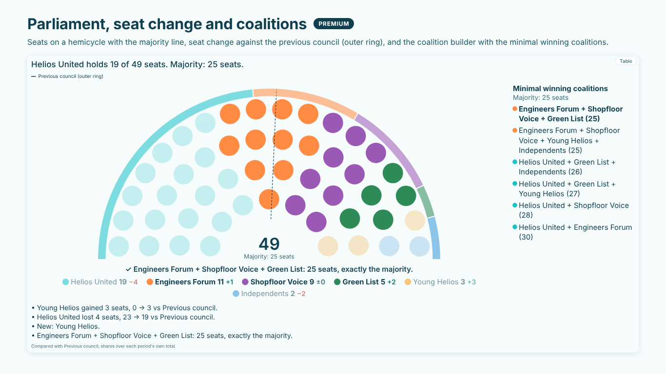
    Works council of 49 seats as a hemicycle with a majority line at 25, the previous council as an outer ring, seat changes per list and a list of minimal winning coalitions
    Pl. LIV  ·  Waffle & Pictogram  ·  Premium: a parliament with seat change against the previous council and the minimal winning coalitions.rendered from the shipped visual
    What it does

    SmartVisuals Waffle & Pictogram draws a waffle chart, dot matrix chart, pictogram chart, icon array, isotype rows, a parliament chart and an infographic card from a Category and a measure. Percent grids of any rows and columns are allotted by largest remainder, so the cells always make exactly 100; unit grids make each cell N units. Icons are free, from a built-in set, per category in the format pane or pasted as an SVG path, and so is a target per category, marked over, on or under.

    Premium answers what moved: cells gained and lost against last period or plan, survey margins of error on the Kish effective base with design weights, wave significance, a sample-size planner for the next wave, seat change in a parliament, the coalitions that reach a majority, small multiples and findings. Every premium feature previews free while you edit, readers without a licence always see the free chart, and the visual makes no external calls. The waffle and pictogram are also views of SmartVisuals Part-to-Whole (smartvisuals.io/visuals/part-to-whole).

    Free and premium

    Where the line is, exactly.

    Report authors see the full premium set in edit mode, so you can evaluate every feature on your own data before assigning a single licence. Unlicensed viewers always get a working chart.

    Free tierevery viewer
    • Grids that add upPercent grids of any rows and columns allotted by largest remainder, so they always make exactly 100; unit grids (1 cell = N); fill direction; one grid or one per category.
    • Icons, freeA built-in set, an icon per category in the format pane, a custom icon as an SVG path or a data:image URI, or an Icon field. Web addresses are ignored.
    • Pictogram layoutsIsotype rows with the last icon cut to the exact value, an icon array, and an infographic card that fills one icon to the share or reads "1 in 4".
    • ParliamentSeats on a semicircle, arch or full circle, with a majority line: simple, two thirds, three fifths or a typed quota.
    • A target, freeOne goal per category, the target cell marked, over, on or under, with status colours.
    • Fill-in and spotlightCells and icons fill in order when the data changes (off with reduced motion), and hovering a category dims the rest.
    • Headline, labels and captionA headline number, labels, a legend, a smart caption ("Likely is the largest share at 37 %") and a methods footnote.
    • Power BI featuresTooltips and report page tooltips, highlight and cross-filter, Ctrl to add, bookmarks, context menu, drilldown and a show condition.
    • Templates, themes and on-object formattingSix templates (Infographic among them), four themes, four fonts, colour rules, fx colours, patterns, transparent background and formatting on the canvas.
    • Accessibility and 20 languagesOne tab stop with arrow keys, a screen-reader live region, an accessible data table, high contrast with fill patterns and a responsive layout for small tiles.
    Premium$1.99 /user/mo · first month free
    • Gained and lost cellsAgainst last period or plan, on the same grid, with the shift in points and units.
    • Survey margins of errorOn the Kish effective base with design weights, drawn as a band of cells, Wilson or normal, at 90, 95 or 99 %.
    • Wave significanceA two-proportion z-test against the last wave, on its own base when you bind Compare base.
    • Sample-size plannerThe respondents the next wave needs to read every share to ± X points, with the design effect of your weights.
    • Seat changeEach list's seats against the previous composition, with the old composition as an outer ring.
    • Coalition builderThe coalitions that reach a majority, smallest first, or the seats of the parties you pick.
    • Small multiples and findingsOne panel per value of a Small multiples field, and up to five findings with "how calculated".
    Getting started

    From empty canvas to first chart.

    1. 01

      Add SmartVisuals Waffle & Pictogram to the page. With no fields bound it opens on its setup guide, which names the wells that are still empty.

    2. 02

      Drop the categories into Category and a measure, such as Respondents, into Values.

    3. 03

      Under View, pick Waffle or Pictogram; set the grid, cell shape and icon under Waffle, or the layout (isotype rows, icon array, parliament or infographic card) under Pictogram.

    4. 04

      Give each category its icon under Category Icons, and add a Target field or One Target for All for progress to goal; Format pane > Templates sets a whole style at once, Infographic among them.

    5. 05

      Optional, premium: bind last wave to Compare, the respondents to Sample size and the effective base to Effective base, or turn on the Coalition Builder in a parliament. Everything previews in full while you edit.

    Get Waffle & Pictogram

    On its way.

    Installation instructions for both paths are on the download page.

    Microsoft Marketplace (recommended)

    The offer is prepared for Microsoft Marketplace and not published yet. This page will link to the listing the moment it is live.

    Coming soon
    Documentation

    Everything else about Waffle & Pictogram.

    The guide, use cases, questions and the full settings reference. Open what you need, or search.

    Search all visuals

    Waffle & Pictogram in Power BI, explained

    6 short chapters: what the visual does and why

    How do I make a waffle chart in Power BI that adds up to 100?

    Rounding each share to a whole cell on its own often fills 99 or 101 cells of a 10 × 10 grid. SmartVisuals Waffle & Pictogram allots the cells by largest remainder: every category gets the whole cells of its share, and the cells still empty go to the largest remainders, so the grid is always exactly full and the labels add up to 100 %. Drop the categories into Category and a measure into Values; the headline number names the largest category.

    Waffle > Rows and Columns take any grid, so 20 × 10 gives cells of half a percent. Grid set to Unit grid makes each cell a fixed number of units (Units per Cell, or 0 for a nice automatic unit) and the footnote says "1 cell = N". Layout draws one grid for all categories or one grid per category, Fill Direction runs row by row, column by column or as a snake, and Cell Shape offers square, rounded, circle (a dot matrix) or an icon.


    Can I use icons, and my own icon per category?

    Yes, free. The built-in set covers people, buildings, vehicles, money and more (person, people, factory, laptop, truck, shopping cart, heart, leaf, bolt...). Category Icons in the format pane takes an icon per category: a built-in name, an SVG path or a data:image URI. Custom Icon (SVG path or data:image) replaces the built-in icon for the whole chart, and an Icon field sets one per row from your data.

    Web addresses are ignored on purpose: the visual makes no external calls and fetches nothing, so an icon from a link would be a broken icon for some readers and a privacy question for all of them.

    Which pictogram layouts are there?

    View > Chart switches between Waffle and Pictogram, and Pictogram > Layout offers four layouts. Isotype rows draw one row per category, one icon per Units per Icon, with the last icon cut to the nearest tenth. Icon array puts every category in one block of icons. Infographic card fills one icon to the share and reads it as a share (37 %), as "1 in 4" or as progress to target (Card Reads).

    Parliament draws seats on a semicircle, an arch or a full circle (Parliament Shape) with a majority line: simple majority, two thirds, three fifths, a typed quota or none. Seats are the values rounded to whole seats, and edit mode says when values had to be rounded.

    Are targets free?

    Yes. A Target field, or Targets > One Target for All, gives each category a goal: the target cell or icon is marked and every category reads over, on or under its target, with Met at and Close at as a percentage of the target and Colour Items by Status for the status colours. With a target and one grid per category, each grid is its category's target, so every grid reads as progress to its own goal.

    Comparisons against last period or plan stay premium, together with the survey statistics, seat change, coalitions and small multiples.

    How do I show survey margins and what moved since the last wave?

    This is premium. Bind last period or plan to Compare and the same grid shows the cells gained (outlined) and lost (hatched), with the shift in points and units. Bind the respondents to Sample size, and for weighted data the Kish effective base to Effective base: Survey Margins draws each share's margin of error (Wilson or normal, 90, 95 or 99 %) as a hatched band of cells around its boundary.

    With Compare bound, Test the Change vs the Compare Wave runs a two-proportion z-test on the effective bases, on the earlier wave's own base when you bind Compare base. Plan the Next Wave: Margin Wanted sets a margin in points and the visual says how many respondents the next wave needs to read every share to it, with the design effect of your weights, such as "n = 1,473 reads every share to ± 3.0 pp at 95 %". In a parliament, Compare shows each list's seat change and Coalition Builder lists the minimal winning coalitions, smallest first. Every statistic is golden-tested.

    What do report readers without a licence see?

    Always a working chart. A reader without a licence sees the free waffle or pictogram of the same data, icons and targets included, and Power BI shows its own short licence note; the visual is never blocked and never watermarked. Gained and lost cells, survey margins, the wave test and planner, seat change, coalitions and findings are left out, and small multiples show the first panel with its name. An unconfigured visual uses no premium feature, so it never raises that note.

    In edit mode and in Power BI Desktop every premium feature previews in full on your own data. Premium is $1.99 per user per month or $19 per user per year through Microsoft Marketplace, assigned per user in the Microsoft 365 admin center. The waffle and pictogram are also views of SmartVisuals Part-to-Whole (smartvisuals.io/visuals/part-to-whole), with pie and donut, rose, radial bar, funnel and Marimekko over the same fields.

    Use cases

    Where Waffle & Pictogram earns its place

    Survey answers that add up to exactly 100 %

    The Helios customer survey asks how likely buyers are to reorder. Answer goes to Category and Respondents to Values; the percent grid allots its cells by largest remainder, so Very likely, Likely, Neutral, Unlikely and Very unlikely always fill the grid exactly. Rows and Columns set the grid (20 × 10 gives cells of half a percent), Cell Shape set to Circle makes a dot matrix, and the headline number names the largest answer.

    Headcount by department, one icon per department

    HR shows headcount for Production, Engineering, Logistics, Sales, Quality and IT as isotype rows: View > Chart set to Pictogram, Layout set to Isotype rows, Units per Icon at 25 and an icon per department under Category Icons (factory, laptop, truck, shopping cart). The last icon of each row is cut to the nearest tenth, and a Target per department (free) draws a rule with over, on or under.

    The works council after the election

    Seats per list go to Values and the list to Category; Layout set to Parliament draws the hemicycle with a simple-majority line (two thirds, three fifths or a typed quota on request). With the previous council in Compare (premium), the outer ring shows the old composition and every list its seat change; Coalition Builder > Show Coalitions (premium) lists the minimal winning coalitions, smallest first.

    Wave 2 of the customer survey, with its margins

    With Respondents in Sample size and the Kish effective base of the weighted data in Effective base (both premium), Survey Margins draws the 95 % margin of error as a hatched band of cells around each answer. Wave 1 in Compare and its base in Compare base test the change on both waves' bases, and Plan the Next Wave sets how many respondents the next wave needs to read every share to ± 3 points.

    A one-in-four infographic card

    For a cover page, Layout set to Infographic card fills one icon to the share; Card Reads switches between Share (such as 37 %), One in N ("1 in 4") and Progress to target. Icon array draws every category in one block of icons.

    Questions

    12 questions asked before you did

    More questions? Write to us.

    Every grid and layout is free: percent and unit waffles, dot matrix, icon cells, isotype rows, icon arrays, infographic cards and parliaments, with icons per category, a target per category, templates, themes, accessibility and 20 languages, with no watermark. Premium, what moved, adds gained and lost cells, survey margins, wave significance, the sample-size planner, seat change, coalitions, small multiples and findings, for $1.99 per user per month or $19 per user per year through Microsoft Marketplace.

    The visual has been submitted to Microsoft Marketplace and is not published yet. This page will link to the listing once it is live.

    The free chart of the same data, icons and targets included, never a blocked or watermarked visual. Comparisons, survey margins, the planner, seat change, coalitions and findings are left out, and small multiples show the first panel with its name. Power BI shows its own short licence note once. In edit mode every premium feature renders in full.

    No. The visual declares no privileges, makes no external calls and sends no telemetry, and icon web addresses are ignored, so nothing is fetched. Every cell count, margin and test is computed inside the visual in your report. The licence is checked through Power BI's own licensing service.

    Category and a measure in Values. Optional: Segment (colours within one grid), Target, Icon (a built-in name, SVG path or data:image URI per category), Tooltips, Annotation and Show condition, plus the premium wells Compare, Compare base, Sample size, Effective base and Small multiples.

    Cells are allotted by largest remainder: each category gets the whole cells of its share, and the cells still empty go to the categories with the largest fractional parts. No category is ever more than one cell from its exact share, and the labels use the same numbers, so they add up to 100 % too. The footnote says so.

    Yes, free. Category Icons sets an icon per category from the built-in set, an SVG path or a data:image URI; Custom Icon (SVG path or data:image) replaces the built-in icon for the whole chart; and an Icon field sets them from your data. Web addresses are ignored, because the visual fetches nothing.

    On the Kish effective base, (Σw)² ÷ Σw², which you bind to Effective base for weighted data, with a Wilson or normal interval at 90, 95 or 99 %. The wave change is a two-proportion z-test on both waves' effective bases, and the planner computes z² · p(1 − p) ÷ e² times the design effect (sample size ÷ effective base), rounded up. All of it is golden-tested.

    Waffle & Pictogram is the single-view edition for unit charts. SmartVisuals Part-to-Whole (smartvisuals.io/visuals/part-to-whole) holds the waffle and pictogram views plus pie and donut, rose, radial bar, funnel and Marimekko over the same fields, with the same free tier and premium layer, for $4.49 per user per month. Microsoft licenses every offer separately, so a licence for one never unlocks the other. For one or two chart types the single views ($1.99 each) cost less; for three or more, the multi-view does.

    Yes. The chart is one tab stop: the arrow keys move between categories, Home and End jump to the first and last, Enter or Space selects (Ctrl adds) and Escape clears. A polite live region reads each category with its value and share, the chart is labelled with its smart caption, and the Table button switches to an accessible data table. High contrast uses the system colours with fill patterns, and Reduce Motion stops the fill-in animation.

    20: English, Czech, Danish, Dutch, French, German, Hungarian, Italian, Japanese, Korean, Norwegian, Polish, Portuguese (Brazil), Portuguese (Portugal), Slovak, Spanish, Swedish, Turkish and Chinese (Simplified and Traditional), for the format pane and every string the visual writes. Numbers follow the report's locale.

    Post it on the public board at smartvisuals.io/feedback, where other users can vote and comment, or use the Report a bug block on the support page (smartvisuals.io/support) or email hello@smartvisuals.io. A screenshot and the fields you bound help most.

    Troubleshooting

    When it does not look right

    Found a bug or missing something? Post it on the requests board; the developer answers within two business days.

    The visual shows a setup page instead of a chart.
    A field is missing: drop the parts into Category and a measure into Values. The setup page names the wells that are still empty, and in edit mode Format pane > Templates applies a style, Infographic among them, without touching fields or premium settings.
    My percentages add up to more than 100 in the data, but the grid is full.
    The grid shows each category's share of the sum of Values, allotted by largest remainder so it always adds up to the whole, and edit mode notes when the values add up to more than 100. Percentages that overlap, as in a multiple-choice question, are not parts of one whole: set Waffle > Layout to One grid per category and Targets > One Target for All to 100 (free), and each grid then reads its own percentage against 100 %.
    The grid grows beyond the rows I set, or the cells are tiny.
    In a unit grid (each cell = N units) the count may not fit Rows × Columns; the grid then grows and edit mode says by how much. Raise Units per Cell or leave it at 0 for a nice automatic unit. Edit mode also warns when cells are only a few pixels wide: use fewer rows and columns, or a larger visual. In isotype rows, raise Units per Icon when a row gets too long.
    My custom icon does not appear.
    Paste an SVG path (the d attribute) or a data:image URI into Custom Icon (SVG path or data:image), or into the Icon field. Web addresses are ignored on purpose: the visual makes no external calls and fetches nothing. Category Icons takes a built-in name (person, factory, bolt...), an SVG path or a data:image URI per category; empty uses the Icon setting.
    The parliament shows a different number of seats than my data.
    A parliament draws whole seats, so values that are not whole numbers are rounded and edit mode says so. It reads best below about 800 seats. For survey shares or headcounts, use the waffle, isotype rows or an icon array instead.
    My readers see the grid without the gained and lost cells or the margins.
    The comparison, survey margins and wave test, the sample-size planner, seat change, coalitions, small multiples and findings are premium, and the reader has no licence. Readers without one see the free chart of the same data, icons and targets included, and Power BI's own licence note; nothing is blocked or watermarked. Assign the licence in the Microsoft 365 admin center.

    Accessibility

    Keyboard, screen readers and high contrast
    Tab
    Moves into the chart, which is one tab stop; the first category gets a dashed focus outline. The Table button is a separate tab stop.
    Arrow keys
    Moves to the previous or next category.
    Home / End
    Jumps to the first or the last category.
    Page Up / Page Down
    Jumps ten categories forward or back.
    Enter or Space
    Selects the focused category and cross-filters the page. Hold Ctrl to add it to the selection.

    Esc
    Clears the selection.

    • Screen readers

      The chart is labelled with its smart caption, such as "Likely is the largest share at 37 %. The top three make up 83 %." A polite live region reads the focused category with its name, value and share.

    • Data table

      The Table button in the corner of the visual (Data Table > Table Button in the Visual, on by default) switches between the chart and an accessible table of every category with its value and share, plus the comparison and the target when they are drawn; Other lists its members. Data Table > Open as Table starts the visual on the table.

    • Not colour alone

      Accessibility > Patterns (Tell Items Apart Without Colour) gives each category its own fill pattern. Targets are marked with a rule and a symbol for over, on or under, lost cells are hatched and gained cells outlined, the survey margin is a hatched band, and seat changes carry their sign.

    • High contrast

      In Windows high contrast mode the visual draws with the contrast theme's foreground, background and selection colours, without glow or tints, and always turns on the fill patterns.

    • Reduced motion

      Waffle > Fill-In Animation and Pictogram > Fill-In Animation fill cells and icons in order when the data changes; Accessibility > Reduce Motion, the operating system's reduced-motion setting or a non-interactive host such as an export turns it off, together with every other transition.

    • Focus outline and text size

      Accessibility > Focus Outline Colour and Focus Outline Width set the outline around the focused category (2.5 px by default; empty colour uses the theme's focus colour, high contrast always the system colour), and Minimum Text Size draws every label, legend, caption and footnote at least that large.

    • Context menu

      Right-clicking a category, a table row or the empty canvas opens the Power BI context menu for it.

    • Responsive layout

      On a small tile the visual drops whole pieces instead of overlapping them: below 320 × 160 px no caption, footnote, findings or legend, below 480 px wide the legend moves to the bottom, and labels that do not fit are dropped whole, never cut. Every value stays in the tooltip and the data table.

    • Languages

      The format pane, captions, footnotes, findings, tooltips, the data table and screen reader labels are available in 20 languages: Chinese (simplified and traditional), Czech, Danish, Dutch, English, French, German, Hungarian, Italian, Japanese, Korean, Norwegian, Polish, Portuguese (Brazil and Portugal), Slovak, Spanish, Swedish and Turkish. Numbers follow the report's locale.

    Missing something?

    Tell us what is missing.

    A feature you need, a bug you hit, a visual that does not exist yet. Every message reaches the person who builds these visuals, and feature requests shape what ships next. We also build visuals to order.

    Also in the family